
Wedding Album Design August 2005
www.ArtificialRainbow.com Copyright 2005, Roman Zolin Page 1 of 16
Wedding Album Design
Part 1
I don't want to discuss the various types of albums and covers. I will focus on the actual work of creating the design
of the album and highlight some of the details that may improve the impact of the album.
Doing some research I’ve seen several applications and tools that provide various capabilities to design albums.
Such tools could provide large number of layouts of the photographs and various supporting features like borders
and digital effects. But after reading messages in forums and reviews, it seems that there is no a single solution
that would provide all the capabilities and be stable (or without bugs). There is one thing that concerns me most –
the creativity, it’s very hard (if at all possible) to facilitate the process and allow the photographer the creativity,
which could be done with Photoshop or similar tools. Probably I have to add that after looking at numerous albums
most of them seem similar and somewhat rigid or chopped. What do I mean by rigid and chopped? Well, if you take
a look most of the lines in such albums (layouts) almost always either verticals or horizontal. Sure, it happens
because of the borders of the photographs. But who makes us to follow the same pattern every time? If you’ve read
my article about graphical elements in photographs, you know that there is more to it than a couple of
perpendicular lines. And I like diagonals most of all, as I see it, the lines (especially diagonals) create the flow in
the album page, exactly the same as the lines create the flow in the photographs.
So our challenge is to create a photograph (album page) out of several regular photographs (regular not in sense of
aesthetics). Let’s refresh the basics of the photograph, how we “design” a photograph. Looking in to a pure
abstraction of the photograph, we can see the lines and spots of light and shadow. Lines usually created by the
border of light and shadow, but instead of a simple dot on the photograph, they are like a fences. And our eye tries
to jump over the fence. Such an action requires some effort, so if the fence is low (low contrast: difference
between the light and shadow is small), then the eye easily travels across the fence, or at least with a little notice.
On the other hand, when the contrast is high, the fence will be high as well, and it might require a lot of strength
for our eye to climb over. In such situations, to continue its travel the eye usually tries the least resistive way – it
goes along the fence looking for a break in the fence or where it will be easier to climb over. That’s how the eye
travels along the lines. Similar situation with spots of light or shadow, those more like hills and pits, which are
another obstacles for a traveling eye. I have to mention that the lines may not always be created by light and
shadow. When our eye recognizes a face it reaches for the eyes of the person (that’s when we so disappointed
when we don’t see they eyes or their expression is not what we expected). And even further, the mind recognizes
the direction the eyes look and gives the command to the eye travel over there and see what happens there.
That was the very basics of the light and shadow travel of our eye. Now, when we know how the eye travels, or
actually why our eye travels, we can try to create a maze out of those obstacles – fences, hills and pits (or pools). It
seems like we are trying to create an amusement park, where the customer is the viewer’s eye. And there are the
same basic principles – to keep the eye moving, sometimes let it have some rest, and always try to suggest some
way out of the dead end. Don’t forget your goal to keep the eye within your park.
I hope you got the idea about the means we can control the viewer’s eye. We don’t have to loose the control in the
album page with several photographs, it just becomes more complex to do so, but still possible. In order to steer
the eye, we use the same techniques, but on a higher level. Each photograph in the album page will have its own
direction or orientation. This orientation depends on the most prominent lines in the photograph. It happens when
most of the lines or one big line creates a sense of motion, which has a sense of direction. Or there is another more
common situation, a person in a photograph looks from the camera, and his/her eyes create the line that leads out
of the frame. There is the other side of the coin – the photograph is somewhat static (something happens in the
center and there is no sense of motion) or the person looks into the camera. Such photographs look like anchors;
it’s hard to decide where to look after such photograph. There is nothing wrong with these photographs, they could
be very compelling, but the eye tends to stay on the photograph and examine those little details that we may
overlook at the first glance. I think, such photographs should be like a rest stop on the eye’s way and be placed
closer to the center of the album.
Well, we came closer to the actual design of the album, so let’s start from the basic page template.
Creating an empty template
As you probably already know, I use Photoshop to do all the retouching, and today I am again going to use this very
powerful tool to design album pages.

Wedding Album Design August 2005
www.ArtificialRainbow.com Copyright 2005, Roman Zolin Page 2 of 16
The first thing that you have to do is decide what album size you want to produce. This decision will be based
mostly on your budget and the company you work with. For example I will start with 12x12 album page. You
probably have seen the album mockups, they almost always done as a page-spread (two pages together). Some
companies don’t do page-spreads, so you have to find out if you have such an option, and what kind of template
you have to use. To make the cutting of album pages more accurate and somewhat safe, you may be asked to
design the page with certain margin (not a bleed, which is just an empty space). This margin could be somewhere
between 1/8 and 1/6 of the inch.
Now, we ready to create a template, which we will reuse for all the pages.
1. Start by creating a new PSD document, with the actual size of the album spread, in my case it is 12x12
inches. Please note that the resolution for the PSD document should be set at 300 pixels/inch, it will insure
that when printed the page will look nice.
Here are the settings I’ve chosen for the template:
2. After creating the document I set the guidelines along the borders and in the middle of the page, so later I
can align my elements and see the actual borders (because later I will add the margin here). To set the
guidelines click on the ruler and drag the pointer to the place you want the guide to be. If you missed, use
“Ctrl” key with the mouse to move the guide. Usually the guides will stick to the borders, so it’s the easy
part. Though there is one tricky part – set a guide in the middle of the page. For that I check the size of the
page in pixels (select in menu Image, Image Size). In my case the width of the page is 7200 pixels. Then I
move the guide where the upper ruler says it is 3600 pixels from the left border.
3. My next step is to add the margin. It’s very easy, just select in menu Image, Canvas Size. Make sure that the
dimension you use is set in inches and the changes are relative to the center of the image. My margin is .15
(half of the shown “0.3”), which is close to 1/6 of an inch.

Wedding Album Design August 2005
www.ArtificialRainbow.com Copyright 2005, Roman Zolin Page 3 of 16
Congratulations, now you have an empty template for your album page-spread. Let’s continue with adding some
template elements.
Adding Template Elements
By adding new elements to the template we will define the layout of the page, which later we will fill with the
photographs. I will start with a simple rectangle that is more or less in the center of a single page, which will be
used as a placeholder for one of the photographs. On the other page of the page-spread I will combine several
photographs.
Single Photograph
1. Create a new empty layer atop of the background one: in menu Layer, New, Layer (or pressing Ctrl-Shift-N)
2. Select “Rectangular Marquee” as your current tool and draw a rectangle on the page in such a way that
there is some room around the image:
3. Fill out the selection with some color (I used blue) by pressing Alt-Backspace or selecting in menu Edit, Fill
and specifying the parameters. (To deactivate the selection press Ctrl-D or select in menu Select, Deselect)
4. Don’t worry about the actual size or position of the rectangle. In this step we will set the size and position.
First let’s set the right size of the rectangle. Pressing “Ctrl” key, click on the icon of the top layer (Layer
1). You rectangle will be selected, if you deselected it. Make sure that your current tool is “Move Tool”
5. Click Ctrl-T or select in menu Edit, Free Transform. Now you can move, scale, rotate or skew the rectangle
as you like. If you want to align the rectangle in the center of the page, make sure that the layer with the
rectangle is active and then using the Marquee tool select the page – a single square (along the guidelines)
and go to menu Layer, Align to Selection, Vertical Centers (to align vertically) and Layer, Align to Selection,
Horizontal Centers (to align horizontally).

Wedding Album Design August 2005
www.ArtificialRainbow.com Copyright 2005, Roman Zolin Page 4 of 16
Background
By now we created a very simple template for a photograph. In the next steps I will add the background to the
page, which will be taken from another photograph.
1. Select Background layer (the bottom layer in the stack)
2. Click the icon “ ” at the bottom of the pane or select in menu Layer, New, Layer – it will create a new
layer above the background, right beneath the layer with our image.
3. Select the whole left page including the margin.
4. Set the foreground color as white and click Alt-Backspace to fill the selection with the color.
5. Duplicate the layer by pressing Ctrl-J or selecting in menu Layer, New, Layer via Copy
6. Now we have Layer 3 above the Layer 2. Layer 3 will be our screen in front of the photograph, which will be
placed in Layer 2. Our final step for the background is to set certain parameters for the Layer 3 (the screen
layer) – Set the opacity of the layer at 70-80%, and the blending mode to “Screen”
Wedding Album Design August 2005
www.ArtificialRainbow.com Copyright 2005, Roman Zolin Page 5 of 16
Placing the photographs
We can consider our template for the left page of this spread to be ready, so let’s place the photographs in
there.
1. Open a photograph you want to use as the background on the page
2. Select the whole photograph – Ctrl-A or selecting in menu Select, All
3. Place it in the clipboard – Ctrl-C or in menu Edit, Copy
4. Switch back to the album template
5. Make sure that the Layer 2 is active (click on the layer in the layer pane)
6. Holding Ctrl key click on the icon of the Layer 2 (our background image layer) – the left page should be
selected after that.
7. Click Ctrl-Shift-V or in menu Edit, Paste Into – it will put the image into the selection on the active layer
8. Probably the image is not the right size and placed somewhat wrong. We correct it by moving and scaling
the image. To do so press Ctrl-T or menu Edit, Free Transform, then scale and move the image as you see it
fit. Use Shift key while scaling the image to preserve the proportions of the image. After you are done,
press Enter key, it will exit the mode of transformation.
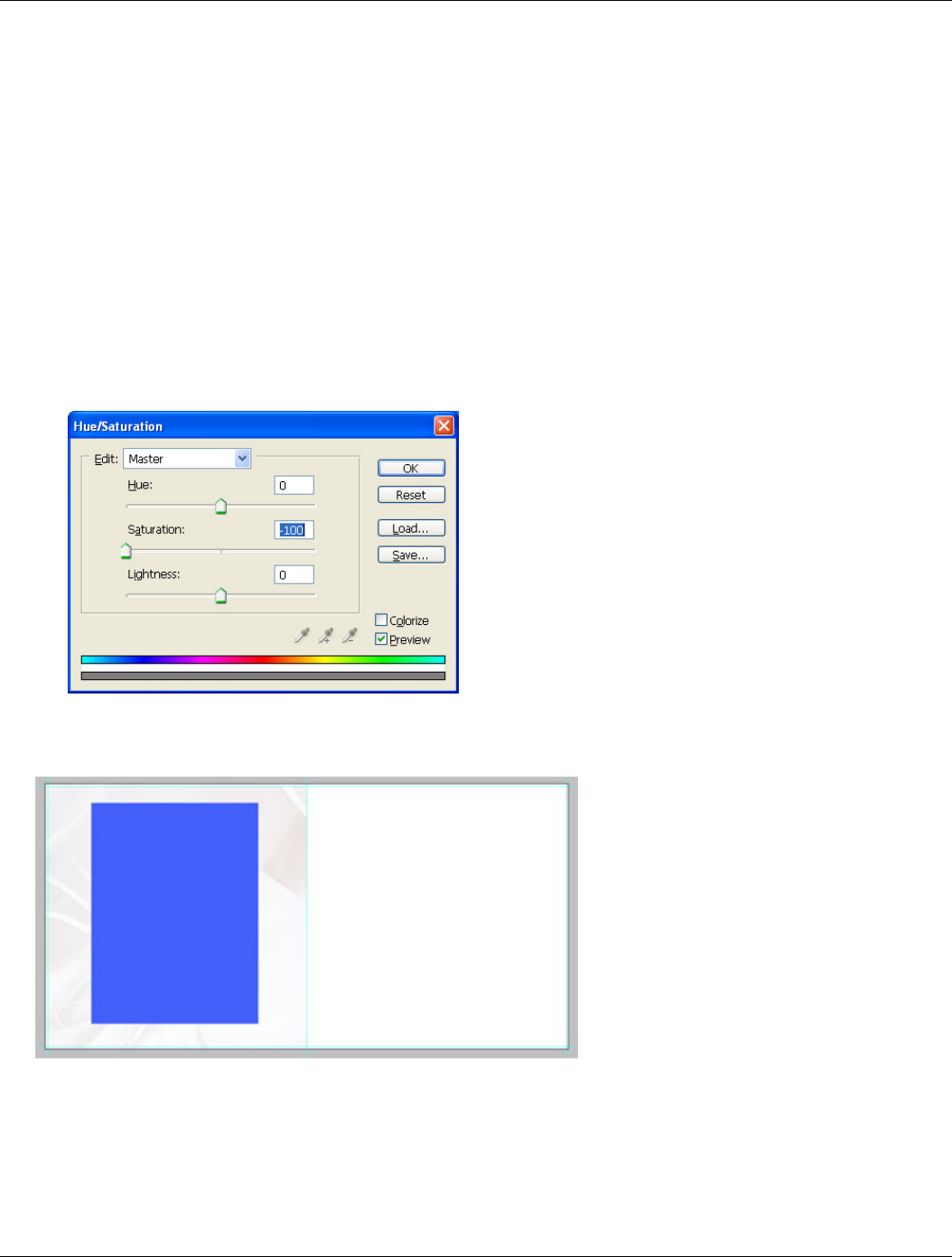
9. If you need a black and white photograph for your background, use Ctrl-U (Saturation Dialog) to desaturate
the image by moving the slider “Saturation” in the very left position
10. You may want to adjust the opacity of the screen layer (Layer 3) to make the background more or less
prominent.
Well, congratulations, the background image is created and placed in the album page:
Once we finished with the background image we can start working on the foreground image.
11. Apply the steps 1 through 8 (see above) to our rectangle on the Layer 1.
12. You should get something similar to this:

Wedding Album Design August 2005
www.ArtificialRainbow.com Copyright 2005, Roman Zolin Page 6 of 16
with the layer pane looking like this:
You can stop here, but I would add some embellishments to the page, such as a simple border to the
photograph and maybe a shadow:
1. Make sure that the top layer is selected (the one with the foreground photograph)
2. Holding Ctrl key click on the icon of the Layer 1 (with our rectangle) – the foreground photograph will be
selected
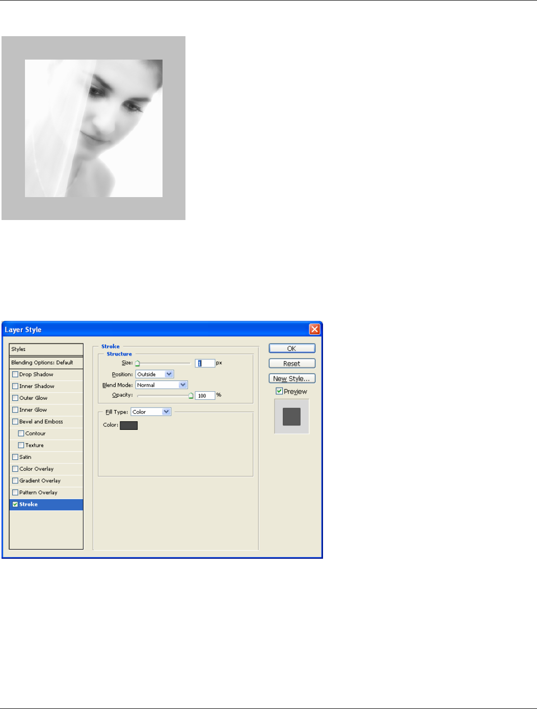
3. Go to menu Edit, Stroke and set the following parameters as shown in the dialog:
4. Deactivate the selection – Ctrl-D
Here we have the black border around the photograph. Now let’s add the shadow


Wedding Album Design August 2005
www.ArtificialRainbow.com Copyright 2005, Roman Zolin Page 8 of 16
Part 2
Here I continue the story of creating a wedding album. This article is going to cover the following aspects:
• Composition, Story, Balance
• Two or more photographs on a page
• Simple borders
• Fancy borders
Composition, Story, Balance
So, in the Part 1 we talked about creating a template and placing a single photograph. Now it's time to add more
photographs and do something about that. Let’s just refresh some basics about the composition – the page (or the
page-spread) should have a flow, people on the photographs better be looking into the album (to the stitch). And
when put several photographs on the page, the sense of telling a story greatly increases, which makes us be more
cautious about mixing images that don’t fit together.
When we are telling a story, we should remember that both pages of the page-spread will be participating in the
story, and their order should be in sync with the flow of events. In other words, the images on the page-spread
should be like a book, which depicts the events of the wedding day and you read it from left to right. It is known
that the right page of the book/album (of the page-spread) attracts most of the attention, when the viewer opens
it. That’s why I suggest put your accent on the right page and place the better photograph on the right part of the
page spread. Such an approach sometimes creates conflicts with the flow – people on the left side photographs may
look outside of the album. But there is a trick – flip the photograph, so the people start looking into the album.
Though you have to be careful and watch for all the details, because some of the details in the photograph could
contradict with the real life. For example, the text that is visible in the photograph could tell the viewer that you
flipped the image. Or what if the very next photograph shows the same place that looks like a mirror – all objects
are the same but in a reverse order?
The next we should consider is the balance between the photographs and the empty space around. It shouldn’t be
crowded and overall balance on the page should be somewhere in the middle or slightly to the bottom. How do you
evaluate the weight of the photographs? That’s a tough question, but I consider the density of the tone (dark or
light) and the size of the photograph. The darker and bigger the image the heavier it is on the page. Bright and
small photographs considered to be lighter. There could be one additional factor to consider – the contrast. The
contrast adds to the weight, but the weight in this case more about attraction of the eye. The greater contrast the
stronger the eye is pulled to the image.
Sometimes you intentionally can break the balance (as any other rules), and in such case you will create a dynamic
tension, which adds variety to the album (and general appeal). But don’t make it too dramatic and don’t make too
many unbalanced pages – it should be the spice, not the dish.
Another issue with the balance is the balance between occupied and empty space. As my father said “the page
should have some air to breathe”. Leave space around the photographs in such a way that the photograph(s)
wouldn’t look lonely or too big and more like sprawling over the edges. Though you can easily allow the photograph
to take the whole page without any kind of borders or margins, so the photograph becomes the page.
Two photographs on a page
I think it’s time to do something instead of just chatting about the stuff. Let’s create a simple page with two
photographs for starters. We will begin with our design that we created in the previous article:

Wedding Album Design August 2005
www.ArtificialRainbow.com Copyright 2005, Roman Zolin Page 9 of 16
I am going to move the photograph to one of the sides of the page and add another one to the other side. To do so…
1. First I select the existing image by clicking on the layer with the image and holding Ctrl key
2. By pressing Ctrl-T I am switching into Editing mode, where I can transform the image
3. Then I adjust the size and position of the image. Hold Shift key while changing the size to keep the
proportions of the image intact.
Note: If you noticed the height and width of the image is bigger than the half of the page and I placed the
image to the right bottom corner. You may ask why or will the second image will be smaller? Well, the next
photograph I add is going to be of the similar size and it will overlap the first one. The position of the first
photograph is not accidental either – the left top corner of the image doesn’t say add much to the image –
it’s a window drape. So we can easily hide it by the next photograph.
4. Add a new image to the page:
a. Open the image in another window
b. Drag the layer with the image onto our album page
5. Transform the image and position it in the left top corner of the page (use Ctrl-T)
6. I got the following composition:
At this point I see two major flaws: first the second image cuts the head of the girl on the photo beneath and those
two photographs blend in where the white areas overlap each other. And I am going to do something about that. My

Wedding Album Design August 2005
www.ArtificialRainbow.com Copyright 2005, Roman Zolin Page 10 of 16
idea is to crop the head shot photograph from the bottom and add the border and shadow to the photograph to
separate it from the one below:
1. Switch to Marquee tool (a rectangle area)
2. Select the area which you want to leave in the photograph:
Note: The selection includes surroundings on top and both sides of the photograph; as well it cuts off some
part of the bottom. Currently I am not concerned about anything except the lower part, so I just included
space outside of the image – that way it’s much easier to select
3. Create a layer mask for the image – click the mask button (with the icon “ ”) at the bottom of the Layer
panel.
4. You should see the effect immediately – the lower part of the image has disappeared. And you layer comp
looks something like that:
5. Now I am going to do the same border as the first image has. And it’s very simple – just drag the layer with
effects over to the layer with the image.
6. After that I see that the page will benefit if we reduce the size of the images and move them slightly apart.
Which is done by using Ctrl-T key combination – separately for each image.

Wedding Album Design August 2005
www.ArtificialRainbow.com Copyright 2005, Roman Zolin Page 11 of 16
7. And here is our result:
Please note that the second photograph with the head shot was selected with a purpose. The eyes of the girl lead
us to the next photograph, which creates the flow. As well the photograph has lighter overall tone and feel, so the
balance is shifted somewhat to the right lower corner, where the darker image dominates the page. The only bad
thing here is that the flow of events is incorrect. On the left the girl is wearing the make up and her veil is on, but
on the left she is only putting on makeup. But here I am showing here only the design, not the story.
Simple Borders
You already know a simple trick to create very simple border around a photograph – Stroke. To refresh your
memory, this command is accessible through main menu Edit, Stroke. Though it works only when you have selected
an area with the Marquee tool and sometimes it gets in a way, when you selected a wrong layer or try to resize or
move the image. So, Photoshop allows us to do better and be less dependent on the actual image. And here are the
ways to create simple borders.
Let’s play with it. I will start with the following setup:
Wedding Album Design August 2005
www.ArtificialRainbow.com Copyright 2005, Roman Zolin Page 12 of 16
Where the top layer has the image, which is smaller than the background. So before I do anything, the image looks
like this:
Stroke as an effect
Among the effects, which you can apply to a layer, there is a Stroke effect. This effect is accessible through a
double click on the layer (not on the icon or the layer name) or through main menu: Layer, Layer Style, Stroke.
1. I Double click on the layer (to the right from the layer name) and open the dialog with layer effects
2. In the dialog I activate and select the Stroke feature and set the parameters as shown below:

Wedding Album Design August 2005
www.ArtificialRainbow.com Copyright 2005, Roman Zolin Page 13 of 16
As the result I get a simple gray border (the width is 1 pixel) and the image now looks like that:
But I want to do something more interesting with it – add a gradient to it:
1. Go back to the Stroke effect
2. Change the fill type as “Gradient”
3. The other parameters you can see on the dialog:
And the image looks different now. It has an interesting border:

Wedding Album Design August 2005
www.ArtificialRainbow.com Copyright 2005, Roman Zolin Page 14 of 16
Usually I would a shadow to better separate the image from the background, and hence I would get something like
that:
OUTER GLOW
1. Double click on the layer to get to the Layer Style dialog.
2. Select and activate Outer Glow effect and specify the parameters as show below:
Note: Try to select the color of the glow somewhere in between the background color and white. It will
make the effect softer and the transition will be somewhat smoother. You can play with the parameters to
get the effect you like. One of the parameters that can give you a different look is the Contour.

Wedding Album Design August 2005
www.ArtificialRainbow.com Copyright 2005, Roman Zolin Page 15 of 16
With the parameters set as in the above dialog I get the following picture:
But if I start playing with the contour it gets crazy:
Bevel and Emboss
There is another effect that could work as a border, and which I sometimes use. The effect is “Bevel and Emboss”
in the same Layer Style dialog. By using this effect you add a slight 3D look to the image. The image start looking as
a tile, with highlights on one side of the border and shadow on the other one. The steps are very simple:
1. Open the dialog “Layer Style” – double click on the layer (aside from the name)
2. Select “Bevel and Emboss” and set the following parameters:

Wedding Album Design August 2005
www.ArtificialRainbow.com Copyright 2005, Roman Zolin Page 16 of 16
And again, nothing prevents you from playing with those parameters and adjusting the look as you want. You may
consider activating Contour effect (which is right below Bevel and Emboss).
The parameters set as above give the following look to the image:
