1
Guide to Creating a Bar Chart in Microsoft Word
The following guide provides step by step instructions for how to create a bar chart in Microsoft Word.
Step1
Open Microsoft Word, go to the “insert” tab on the ribbon, and select the “chart” icon.
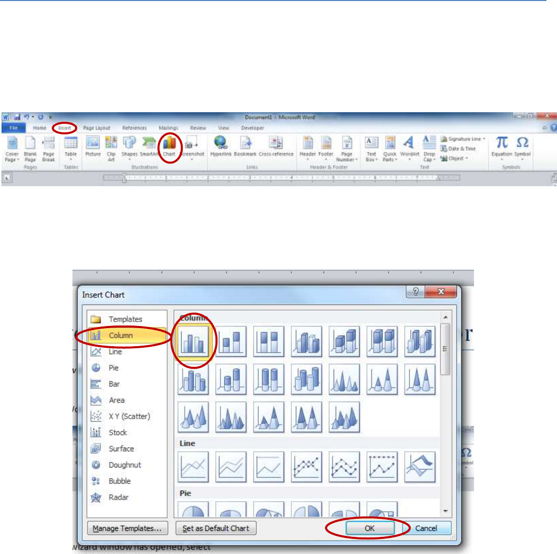
Step 2
Once the “chart” wizard window has opened, select “column” and then select “clustered bar type.” Then select “OK.”

2
Step 3
Enter your data (labels and numbers/percent’s) in the Excel window that opens and then close out of the window by
selecting the “red X” in the upper right corner of the window. Note: You have the ability to resize the data chart range
by adjusting the blue range line (drag the right corner to desired size).
Notes for data entry:
• Category = what you are examining/studying. It could be:
o Time points (quarters, months, weeks, days, etc.)
o Reasons why something occurred (reasons families use the ER, reasons families missed their scheduled
home visits, etc.)
o Etc.
• Series = what you are comparing. It could be:
o Your program’s data compared to the learning collaborative data
o Your program’s data broken down by prior to the improvement and following the improvement
o Your programs data broken down by quarter
o Etc.
Step 4
Edit your chart as needed. Here are some items you may want to consider:
• Add a title
• Add labels to your x and y axis’
• Add data labels to your bars
• Move or remove the key, if needed

3
To add a title to your chart:
• Click on the title box on the chart and type the title you desire. OR
• Go to “Chart Tools” on the ribbon (this option will appear when you click on the chart).
o Go to “Layout”
o Select “Chart Title”
o Select where you would like to place the title.
To add labels to your x and y axis:
• Go to “Chart Tools” on the ribbon (this option will appear when you click on the chart).
o Go to “Layout”
o Select “Axis Titles”
o Select “horizontal” or “vertical”
o Select where you would like to place the title.
12
14
17
20
24
0
5
10
15
20
25
30
Jan-14 Feb-14 Mar-14 Apr-14 May-14
Number of Families
Month
Number of Families that Received the
Expected Number of Home Visits

4
To add data labels to your bars:
• Right click on a bar on your chart
• Select “Add Data Labels”
• Select position of data labels on your chart:
o Right click on the bar on your chart again
o Select “Format Data labels”
o Select the “position” of your data labels

5
To move or remove key:
• To move (note: If you have a series, you will want to keep the key. You may want to move the key to a different
location than where Microsoft Word automatically places it.)
o Right click on key
o Select “Format Legend”
o Select where you would like the key to appear on your chart.

6
• To remove (note: If you do not have a series, you will want to consider if the key adds more information. If you
determine that it does not, you will want to remove the key.)
o Select key on chart
o Delete key
