
ComponentOne
GridView for ASP.NET
AJAX

Copyright
2011 ComponentOne LLC. All rights reserved.
Corporate Headquarters
ComponentOne LLC
201 South Highland Avenue
3
rd
Floor
Pittsburgh, PA 15206 ∙ USA
Internet: info@ComponentOne.com
Web site: http://www.componentone.com
Sales
E-mail: sales@componentone.com
Telephone: 1.800.858.2739 or 1.412.681.4343 (Pittsburgh, PA USA Office)
Trademarks
The ComponentOne product name is a trademark and ComponentOne is a registered trademark of ComponentOne LLC. All
other trademarks used herein are the properties of their respective owners.
Warranty
ComponentOne warrants that the original CD (or diskettes) are free from defects in material and workmanship, assuming
normal use, for a period of 90 days from the date of purchase. If a defect occurs during this time, you may return the defective
CD (or disk) to ComponentOne, along with a dated proof of purchase, and ComponentOne will replace it at no charge. After
90 days, you can obtain a replacement for a defective CD (or disk) by sending it and a check for $25 (to cover postage and
handling) to ComponentOne.
Except for the express warranty of the original CD (or disks) set forth here, ComponentOne makes no other warranties, express
or implied. Every attempt has been made to ensure that the information contained in this manual is correct as of the time it was
written. We are not responsible for any errors or omissions. ComponentOne’s liability is limited to the amount you paid for the
product. ComponentOne is not liable for any special, consequential, or other damages for any reason.
Copying and Distribution
While you are welcome to make backup copies of the software for your own use and protection, you are not permitted to make
copies for the use of anyone else. We put a lot of time and effort into creating this product, and we appreciate your support in
seeing that it is used by licensed users only.
This manual was produced using ComponentOne Doc-To-Help™.

iii
Table of Contents
ComponentOne GridView for ASP.NET AJAX Overview ..............................................................................1
What's New in GridView for ASP.NET AJAX............................................................................................. 1
Revision History............................................................................................................................................. 1
What's New in 2011 v1..................................................................................................................... 1
What's New in 2010 v3..................................................................................................................... 2
What's New in 2010 v2..................................................................................................................... 2
Installing GridView for ASP.NET AJAX...................................................................................................... 3
GridView for ASP.NET AJAX Setup Files ..................................................................................... 3
System Requirements ....................................................................................................................... 4
Installing Demonstration Versions ................................................................................................... 4
Uninstalling GridView for ASP.NET AJAX ................................................................................... 5
Deploying your Application in a Medium Trust Environment ....................................................... 5
End-User License Agreement ........................................................................................................................ 8
Licensing FAQs ............................................................................................................................................. 8
What is Licensing?............................................................................................................................ 8
How does Licensing Work?.............................................................................................................. 8
Common Scenarios .......................................................................................................................... 9
Troubleshooting.............................................................................................................................. 11
Technical Support ........................................................................................................................................ 12
Redistributable Files ..................................................................................................................................... 13
About This Documentation ......................................................................................................................... 13
Namespaces.................................................................................................................................................. 14
Creating an AJAX-Enabled ASP.NET Project............................................................................................ 15
Adding the C1GridView Component to a Project ....................................................................................... 17
Upgrading From WebGrid for ASP.NET ................................................................................................... 18
Column Changes ............................................................................................................................ 18
Renamed Members......................................................................................................................... 18
New Members ................................................................................................................................ 20
Removed Members......................................................................................................................... 22
Key Features .............................................................................................................................................. 23

iv
GridView for ASP.NET AJAX Quick Start .................................................................................................. 27
Step 1 of 3: Binding C1GridView to a DataSource ...................................................................................... 27
Step 2 of 3: Customizing the C1GridView Control ..................................................................................... 28
Step 3 of 3: Running the Application ........................................................................................................... 29
Design-Time Support .................................................................................................................................. 35
C1GridView Smart Tag ............................................................................................................................... 35
C1GridView Context Menu ......................................................................................................................... 37
Property Builder ........................................................................................................................................... 38
General Tab .................................................................................................................................... 39
Columns Tab .................................................................................................................................. 40
Paging Tab ...................................................................................................................................... 41
Format Tab ..................................................................................................................................... 43
Grouping Tab ................................................................................................................................. 43
Using GridView for ASP.NET AJAX .......................................................................................................... 44
Visual Styles ................................................................................................................................................. 45
Changing the Visual Style .............................................................................................................. 47
Customizing the Control's Appearance .......................................................................................... 47
Keyboard Navigation ................................................................................................................................... 48
Editing Rows ................................................................................................................................................ 48
Grouping ...................................................................................................................................................... 49
Setting Grouping Properties at Design Time ................................................................................. 49
Setting Grouping Properties at Run Time ...................................................................................... 50
Collapsing and Expanding Groups ................................................................................................ 51
Sorting .......................................................................................................................................................... 52
Filtering ........................................................................................................................................................ 53
Paging........................................................................................................................................................... 54
Using AJAX ................................................................................................................................................. 55
Client-Side Functionality ............................................................................................................................ 55
Client-Side Properties ................................................................................................................................... 55
GridView for ASP.NET AJAX Samples ...................................................................................................... 57
GridView for ASP.NET AJAX Task-Based Help .......................................................................................... 58
Binding the Grid to a Data Source ............................................................................................................... 58
Binding the Grid in a Web Site Project .......................................................................................... 58
Binding the Grid in a Web Application Project ............................................................................. 59
Automatically Updating the Data Source ...................................................................................... 59

v
Using the Property Builder ........................................................................................................................... 60
Setting Properties Using the Property Builder ................................................................................ 60
Adding Columns Using the Property Builder ................................................................................ 61
Formatting the Grid's Content ..................................................................................................................... 62
Customizing Columns Using DataFormatString ........................................................................... 62
Customizing Columns Using ValueLists ....................................................................................... 64
Automatically Sorting Columns ..................................................................................................... 65
Hiding Specified Columns .............................................................................................................. 65
Setting the Footer Text ................................................................................................................... 66
Creating Column Header Bands .................................................................................................... 67
Formatting a Column as Currency ................................................................................................. 69
Adding a Caption to the Grid ......................................................................................................... 70
Adding Controls to a Column ...................................................................................................................... 71
Adding Template Columns ............................................................................................................ 71
Binding Template Columns............................................................................................................ 72
Adding CheckBox or ListBox Controls to a Column .................................................................... 74
Adding ComponentOne Input for ASP.NET AJAX Controls ...................................................... 74
Customizing the Grid's Appearance ............................................................................................................ 77
Adding Borders and Gridlines to the Grid ..................................................................................... 77
Setting Column Width ................................................................................................................... 78
Formatting Rows and Cells Meeting Specific Criteria ................................................................... 79
Changing the Color of Column Headers ........................................................................................ 81
Using Aggregates and Grouping .................................................................................................................. 81
Merging Rows ................................................................................................................................ 81
Grouping Properties ....................................................................................................................... 83
Adding Outlook-Style Grouping .................................................................................................... 83
Creating a Pageable Grid ............................................................................................................................. 84
Adding Paging ................................................................................................................................ 85
Changing Paging Types and Styles ................................................................................................ 86
Using Client-Side Scrolling .......................................................................................................................... 87
Creating a Scrollable Grid .............................................................................................................. 87
Creating a Non-Scrollable Column ................................................................................................ 87
Creating a Non-Scrollable Row ...................................................................................................... 88
Updating the Grid with AJAX ..................................................................................................................... 89
Moving Columns ............................................................................................................................ 89
Editing a Record ............................................................................................................................. 90
Paging the Grid .............................................................................................................................. 90

vi
Selecting a Record .......................................................................................................................... 91
Sorting Columns ............................................................................................................................. 92
Filtering Columns ........................................................................................................................... 92

1
ComponentOne GridView for
ASP.NET AJAX Overview
ComponentOne GridView for ASP.NET AJAX is a flexible,
Microsoft GridView compatible, ASP.NET grid control used to
display items from a data source in an interactive, fully
customizable table.
ComponentOne GridView for ASP.NET AJAX includes one
control, C1GridView, which is used to generate a table of
items, allowing users to select, edit, delete, sort, filter, and
group data at run time. GridView for ASP.NET AJAX
provides the compelling ability to display data across multiple
pages and provide user interactivity with default or
customizable navigation controls. GridView for ASP.NET
AJAX is AJAX standards-compliant and AJAX enhanced.
This means that run-time data can be formatted, manipulated
or reloaded easily by the UI.
Manage the C1GridView column collection, paging behavior,
and edit the control design without code using the C1GridView
control's extensive design-time support. Microsoft GridView
compatibility allows you to quickly convert existing projects
and integrate productively with GridView for ASP.NET
AJAX right away – so get started with GridView for
ASP.NET AJAX today!
Getting Started
Get started with the
following topics:
- Key Features (page
23)
- Quick Start (page 27)
- Samples (page 57)
- Upgrading From
WebGrid for
ASP.NET (page 18)
What's New in GridView for ASP.NET AJAX
This documentation was last revised for 2011 v2. In this release no new enhancements were made to GridView for
ASP.NET AJAX.
Tip: A version history containing a list of new features, improvements, fixes, and changes for each product is
available on HelpCentral at http://helpcentral.componentone.com/VersionHistory.aspx.
Revision History
The revision history details recent enhancements to ComponentOne GridView for ASP.NET AJAX.
What's New in 2011 v1
In the 2011 v1 release the following enhancements were made to GridView for ASP.NET AJAX:
You now can load or save a layout at design time via the Tasks menu:

2
What's New in 2010 v3
In the 2010 v3 release the following enhancements were made to GridView for ASP.NET AJAX:
New Members
The following members were added to the C1GridView control's object model in the 2010 v3 release:
Type
Member
Description
C1GridView
AllowRowHover property
The AllowRowHover property can be used to
disable the row highlighting in the browser.
C1GridView
CellAutosizingMode property
The CellAutosizingMode property determines
the cell size calculations when scrolling is
enabled.
C1GridView
ShowCurrency property
The ShowCurrency property indicates if the
currency is visualized or not.
What's New in 2010 v2
In the 2010 v2 release the following enhancements were made to GridView for ASP.NET AJAX:
Keyboard Support
Additional keyboard support was added to the C1GridView control. At run time, users can now enter the
client-side editing mode on a cell by pressing any alphanumeric key. Users can also now navigate through
the grid by using the arrow and navigation keys (such as Home, End, and so on). See Keyboard
Navigation (page 48) for details.
New Members
New members, including some replacing deprecated members, were added to GridView for ASP.NET
AJAX in the 2010 v2 release. For details see the new member table and the list of breaking changes below.
New Members
The following members were added to the C1GridView control's object model in the 2010 v2 release:
Type
Member
Description

3
C1GridView
ErrorText property
Gets or sets the text to display if an error occurs
during a callback to the server.
C1HyperLinkField
DataNavigateUrlFields
property
Using the DataNavigateUrlFields property you can
combine multiple fields from the data source to
create hyperlinks for the C1HyperLinkField
column.
C1ImageField
DataAlternateTextField
property
Gets or sets the name of the column from the
data source that contains the values to bind to
the AlternateText property of each image in a
C1ImageField object.
DataImageUrlField property
Gets or sets the name of the column from the
data source that contains the values to bind to
the ImageUrl property of each image in a
C1ImageField object.
Breaking Changes
The following breaking changes were made to GridView for ASP.NET AJAX in the 2010 v2 release:
The C1ImageField class' DataAlternateTextColumn and DataImageUrlColumn properties were
deprecated and replaced with the DataAlternateTextField and DataImageUrlField properties accordingly.
The C1HyperLinkField class' DataNavigateUrlField property has been deprecated and replaced with the
DataNavigateUrlFields property.
Installing GridView for ASP.NET AJAX
The following sections provide helpful information on installing GridView for ASP.NET AJAX.
GridView for ASP.NET AJAX Setup Files
The ComponentOne Studio for ASP.NET AJAX installation program will create the following directory:
C:\Program Files\ComponentOne\Studio for ASP.NET. This directory contains the following subdirectories:
Bin
Contains copies of all binaries (DLLs, Exes) in the
ComponentOne Visual Studio ASP.NET package.
C1WebUi
Contains files (at least a readme.txt) related to the product.
C1WebUi\VisualStyles
Contains all external file themes.
The ComponentOne Studio for ASP.NET AJAX Help Setup program installs integrated Microsoft Help 2.0 and
Microsoft Help Viewer help to the C:\Program Files\ComponentOne\Studio for ASP.NET directory in the
following folders:
H2Help
Contains Microsoft Help 2.0 integrated documentation for all Studio
components.
HelpViewer
Contains Microsoft Help Viewer Visual Studio 2010 integrated
documentation for all Studio components.
Samples
Samples for the product are installed in the ComponentOne Samples folder by default. The path of the
ComponentOne Samples directory is slightly different on Windows XP and Windows 7/Vista machines:
Windows XP path: C:\Documents and Settings\<username>\My Documents\ComponentOne Samples

4
Windows 7/Vista path: C:\Users\<username>\Documents\ComponentOne Samples
The ComponentOne Samples folder contains the following subdirectories:
Common
Contains support and data files that are used by many of the demo
programs.
Studio for
ASP.NET\C1WebUi
Contains samples and tutorials for GridView for ASP.NET AJAX.
Samples can be accessed from the ComponentOne Sample Explorer. To view samples, on your desktop, click the
Start button and then click All Programs | ComponentOne | Studio for ASP.NET | Samples | Palomino
Samples.
System Requirements
System requirements include the following:
Operating Systems:
Windows 2000
Windows Server® 2003
Windows Server® 2008
Windows XP SP2
Windows Vista™
Windows 7
Web Server:
Microsoft Internet Information Services (IIS) 5.0 or later
Environments:
.NET Framework 2.0 or later
Visual Studio 2005 or later
Internet Explorer® 6.0 or later
Firefox® 2.0 or later
Safari® 2.0 or later
Disc Drive:
CD or DVD-ROM drive if installing from CD
Note: GridView for ASP.NET AJAX requires Microsoft ASP.NET AJAX Extensions installed and a ScriptManager on
the page before the C1GridView control is placed on the page. You must create an ASP.NET AJAX-Enabled Project
so that the ScriptManager and Microsoft AJAX Extensions are included on the page. For more information, see
Creating an AJAX-Enabled ASP.NET Project (page 15). For more information about Microsoft ASP.NET AJAX Extensions,
see http://ajax.asp.net/. For information about the ScriptManager, see MSDN.
Installing Demonstration Versions
If you wish to try GridView for ASP.NET AJAX and do not have a serial number, follow the steps through the
installation wizard and use the default serial number.
The only difference between unregistered (demonstration) and registered (purchased) versions of our products is
that registered versions will stamp every application you compile so a ComponentOne banner will not appear
when your users run the applications.

5
Uninstalling GridView for ASP.NET AJAX
To uninstall Studio for ASP.NET AJAX:
1. Open the Control Panel and select Add or Remove Programs or Programs and Features (Windows
7/Vista).
2. Select ComponentOne Studio for ASP.NET AJAX and click the Remove button.
3. Click Yes to remove the program.
To uninstall Studio for ASP.NET AJAX integrated help:
1. Open the Control Panel and select Add or Remove Programs (Programs and Features in Windows
7/Vista).
2. Select ComponentOne Studio for ASP.NET AJAX Help and click the Remove button.
3. Click Yes to remove the integrated help.
Deploying your Application in a Medium Trust Environment
Depending on your hosting choice, you may need to deploy your Web site or application in a medium trust
environment. Often in a shared hosting environment, medium trust is required. In a medium trust environment
several permissions are unavailable or limited, including OleDbPermission, ReflectionPermission, and
FileIOPermission. You can configure your Web.config file to enable these permissions.
Note: ComponentOne controls will not work in an environment where reflection is not allowed.
ComponentOne ASP.NET controls include the AllowPartiallyTrustedCallers() assembly attribute and will work
under the medium trust level with some changes to the Web.config file. Since this requires some control over the
Web.config file, please check with your particular host to determine if they can provide the rights to override these
security settings.
Modifying or Editing the Config File
In order to add permissions, you can edit the exiting web_mediumtrust.config file or create a custom policy file
based on the medium trust policy. If you modify the existing web_mediumtrust.config file, all Web applications
will have the same permissions with the permissions you have added. If you want applications to have different
permissions, you can instead create a custom policy based on medium trust.
Edit the Config File
In order to add permissions, you can edit the exiting web_mediumtrust.config file. To edit the exiting
web_mediumtrust.config file, complete the following steps:
1. Locate the medium trust policy file web_mediumtrust.config located by default in the
%windir%\Microsoft.NET\Framework\{Version}\CONFIG directory.
2. Open the web_mediumtrust.config file.
3. Add the permissions that you want to grant. For examples, see Adding Permissions (page 6).
Create a Custom Policy Based on Medium Trust
In order to add permissions, you can create a custom policy file based on the medium trust policy. To create a
custom policy file, complete the following steps:
1. Locate the medium trust policy file web_mediumtrust.config located by default in the
%windir%\Microsoft.NET\Framework\{Version}\CONFIG directory.
2. Copy the web_mediumtrust.config file and create a new policy file in the same directory.
Give the new a name that indicates that it is your variation of medium trust; for example,
AllowReflection_Web_MediumTrust.config.

6
3. Add the permissions that you want to grant. For examples, see Adding Permissions (page 6).
4. Enable the custom policy file on your application by modifying the following lines in your web.config file
under the <system.web> node:
<system.web>
<trust level="CustomMedium" originUrl=""/>
<securityPolicy>
<trustLevel name="CustomMedium"
policyFile="AllowReflection_Web_MediumTrust.config"/>
</securityPolicy>
...
</system.web>
Note: Your host may not allow trust level overrides. Please check with your host to see if you have these rights.
Allowing Deserialization
To allow the deserialization of the license added to App_Licenses.dll by the Microsoft IDE, you should add the
SerializationFormatter flag to security permission to the Web.config file. Complete the steps in the Modifying or
Editing the Config File (page 5) topic to create or modify a policy file before completing the following.
Add the SerializationFormatter flag to the <IPermission class="SecurityPermission"> tag so
that it appears similar to the following:
<NamedPermissionSets>
<PermissionSet
class="NamedPermissionSet"
version="1"
Name="ASP.Net">
<IPermission
class="SecurityPermission"
version="1"
Flags="Assertion, Execution, ControlThread,
ControlPrincipal, RemotingConfiguration, SerializationFormatter"/>
...
</PermissionSet>
</NamedPermissionSets>
Adding Permissions
You can add permission, including ReflectionPermission, OleDbPermission, and FileIOPermission, to the
web.config file. Note that ComponentOne controls will not work in an environment where reflection is not
allowed. Complete the steps in the Modifying or Editing the Config File (page 5) topic to create or modify a policy
file before completing the following.
ReflectionPermission
By default ReflectionPermission is not available in a medium trust environment. ComponentOne ASP.NET
controls require reflection permission because LicenseManager.Validate() causes a link demand for full trust.
To add reflection permission, complete the following:
1. Open the web_mediumtrust.config file or a file created based on the web_mediumtrust.config file.
2. Add the following <SecurityClass> tag after the <SecurityClasses> tag so that it appears similar
to the following:
<SecurityClasses>
<SecurityClass Name="ReflectionPermission"
Description="System.Security.Permissions.ReflectionPermission, mscorlib,
Version=2.0.0.0, Culture=neutral, PublicKeyToken=b77a5c561934e089"/>

7
...
</SecurityClasses>
3. Add the following <IPermission> tag after the <NamedPermissionSets> tag so it appears similar
to the following:
<NamedPermissionSets>
<PermissionSet class="NamedPermissionSet" version="1"
Name="ASP.Net">
<IPermission
class="ReflectionPermission"
version="1"
Flags="ReflectionEmit,MemberAccess" />
...
</PermissionSet>
</NamedPermissionSets>
4. Save and close the web_mediumtrust.config file.
OleDbPermission
By default OleDbPermission is not available in a medium trust environment. This means you cannot use the
ADO.NET managed OLE DB data provider to access databases. If you wish to use the ADO.NET managed OLE
DB data provider to access databases, you must modify the web_mediumtrust.config file.
To add OleDbPermission, complete the following steps:
1. Open the web_mediumtrust.config file or a file created based on the web_mediumtrust.config file.
2. Add the following <SecurityClass> tag after the <SecurityClasses> tag so that it appears similar
to the following:
<SecurityClasses>
<SecurityClass Name="OleDbPermission"
Description="System.Data.OleDb.OleDbPermission, System.Data,
Version=2.0.0.0, Culture=neutral, PublicKeyToken=b77a5c561934e089"/>
...
</SecurityClasses>
3. Add the following <IPermission> tag after the <NamedPermissionSets> tag so it appears similar
to the following:
<NamedPermissionSets>
<PermissionSet class="NamedPermissionSet" version="1"
Name="ASP.Net">
<IPermission class="OleDbPermission" version="1"
Unrestricted="true"/>
...
</PermissionSet>
</NamedPermissionSets>
4. Save and close the web_mediumtrust.config file.
FileIOPermission
By default, FileIOPermission is not available in a medium trust environment. This means no file access is
permitted outside of the application's virtual directory hierarchy. If you wish to allow additional file permissions,
you must modify the web_mediumtrust.config file.
To modify FileIOPermission to allow read access to a specific directory outside of the application's virtual
directory hierarchy, complete the following steps:
1. Open the web_mediumtrust.config file or a file created based on the web_mediumtrust.config file.
2. Add the following <SecurityClass> tag after the <SecurityClasses> tag so that it appears
similar to the following:

8
<SecurityClasses>
<SecurityClass Name="FileIOPermission"
Description="System.Security.Permissions.FileIOPermission, mscorlib,
Version=2.0.0.0, Culture=neutral, PublicKeyToken=b77a5c561934e089"/>
...
</SecurityClasses>
3. Add the following <IPermission> tag after the <NamedPermissionSets> tag so it appears similar
to the following:
<NamedPermissionSets>
<PermissionSet class="NamedPermissionSet" version="1"
Name="ASP.Net">
...
<IPermission class="FileIOPermission" version="1"
Read="C:\SomeDir;$AppDir$" Write="$AppDir$" Append="$AppDir$"
PathDiscovery="$AppDir$" />
...
</PermissionSet>
</NamedPermissionSets>
4. Save and close the web_mediumtrust.config file.
End-User License Agreement
All of the ComponentOne licensing information, including the ComponentOne end-user license agreements,
frequently asked licensing questions, and the ComponentOne licensing model, is available online at
http://www.componentone.com/SuperPages/Licensing/.
Licensing FAQs
This section describes the main technical aspects of licensing. It may help the user to understand and resolve
licensing problems he may experience when using ComponentOne WinForms and ASP.NET products.
What is Licensing?
Licensing is a mechanism used to protect intellectual property by ensuring that users are authorized to use software
products.
Licensing is not only used to prevent illegal distribution of software products. Many software vendors, including
ComponentOne, use licensing to allow potential users to test products before they decide to purchase them.
Without licensing, this type of distribution would not be practical for the vendor or convenient for the user.
Vendors would either have to distribute evaluation software with limited functionality, or shift the burden of
managing software licenses to customers, who could easily forget that the software being used is an evaluation
version and has not been purchased.
How does Licensing Work?
ComponentOne uses a licensing model based on the standard set by Microsoft, which works with all types of
components.
Note: The Compact Framework components use a slightly different mechanism for run-time licensing than the
other ComponentOne components due to platform differences.
When a user decides to purchase a product, he receives an installation program and a Serial Number. During the
installation process, the user is prompted for the serial number that is saved on the system. (Users can also enter
the serial number by clicking the License button on the About Box of any ComponentOne product, if available, or
by rerunning the installation and entering the serial number in the licensing dialog box.)

9
When a licensed component is added to a form or Web page, Visual Studio obtains version and licensing
information from the newly created component. When queried by Visual Studio, the component looks for
licensing information stored in the system and generates a run-time license and version information, which Visual
Studio saves in the following two files:
An assembly resource file which contains the actual run-time license
A "licenses.licx" file that contains the licensed component strong name and version information
These files are automatically added to the project.
In WinForms and ASP.NET 1.x applications, the run-time license is stored as an embedded resource in the
assembly hosting the component or control by Visual Studio. In ASP.NET 2.x applications, the run-time license
may also be stored as an embedded resource in the App_Licenses.dll assembly, which is used to store all run-time
licenses for all components directly hosted by WebForms in the application. Thus, the App_licenses.dll must
always be deployed with the application.
The licenses.licx file is a simple text file that contains strong names and version information for each of the
licensed components used in the application. Whenever Visual Studio is called upon to rebuild the application
resources, this file is read and used as a list of components to query for run-time licenses to be embedded in the
appropriate assembly resource. Note that editing or adding an appropriate line to this file can force Visual Studio
to add run-time licenses of other controls as well.
Note that the licenses.licx file is usually not shown in the Solution Explorer; it appears if you press the Show All
Files button in the Solution Explorer's Toolbox, or from Visual Studio's main menu, select Show All Files on the
Project menu.
Later, when the component is created at run time, it obtains the run-time license from the appropriate assembly
resource that was created at design time and can decide whether to simply accept the run-time license, to throw an
exception and fail altogether, or to display some information reminding the user that the software has not been
licensed.
All ComponentOne products are designed to display licensing information if the product is not licensed. None will
throw licensing exceptions and prevent applications from running.
Common Scenarios
The following topics describe some of the licensing scenarios you may encounter.
Creating components at design time
This is the most common scenario and also the simplest: the user adds one or more controls to the form, the
licensing information is stored in the licenses.licx file, and the component works.
Note that the mechanism is exactly the same for Windows Forms and Web Forms (ASP.NET) projects.
Creating components at run time
This is also a fairly common scenario. You do not need an instance of the component on the form, but would like
to create one or more instances at run time.
In this case, the project will not contain a licenses.licx file (or the file will not contain an appropriate run-time
license for the component) and therefore licensing will fail.
To fix this problem, add an instance of the component to a form in the project. This will create the licenses.licx file
and things will then work as expected. (The component can be removed from the form after the licenses.licx file
has been created).
Adding an instance of the component to a form, then removing that component, is just a simple way of adding a
line with the component strong name to the licenses.licx file. If desired, you can do this manually using notepad or
Visual Studio itself by opening the file and adding the text. When Visual Studio recreates the application resources,
the component will be queried and its run-time license added to the appropriate assembly resource.

10
Inheriting from licensed components
If a component that inherits from a licensed component is created, the licensing information to be stored in the
form is still needed. This can be done in two ways:
Add a LicenseProvider attribute to the component.
This will mark the derived component class as licensed. When the component is added to a form, Visual
Studio will create and manage the licenses.licx file, and the base class will handle the licensing process as
usual. No additional work is needed. For example:
[LicenseProvider(typeof(LicenseProvider))]
class MyGrid: C1.Win.C1FlexGrid.C1FlexGrid
{
// ...
}
Add an instance of the base component to the form.
This will embed the licensing information into the licenses.licx file as in the previous scenario, and the
base component will find it and use it. As before, the extra instance can be deleted after the licenses.licx
file has been created.
Please note, that C1 licensing will not accept a run-time license for a derived control if the run-time license is
embedded in the same assembly as the derived class definition, and the assembly is a DLL. This restriction is
necessary to prevent a derived control class assembly from being used in other applications without a design time
license. If you create such an assembly, you will need to take one of the actions previously described create a
component at run time.
Using licensed components in console applications
When building console applications, there are no forms to add components to, and therefore Visual Studio won't
create a licenses.licx file.
In these cases, create a temporary Windows Forms application and add all the desired licensed components to a
form. Then close the Windows Forms application and copy the licenses.licx file into the console application
project.
Make sure the licenses.licx file is configured as an embedded resource. To do this, right-click the licenses.licx file in
the Solution Explorer window and select Properties. In the Properties window, set the Build Action property to
Embedded Resource.
Using licensed components in Visual C++ applications
There is an issue in VC++ 2003 where the licenses.licx is ignored during the build process; therefore, the licensing
information is not included in VC++ applications.
To fix this problem, extra steps must be taken to compile the licensing resources and link them to the project. Note
the following:
1. Build the C++ project as usual. This should create an .exe file and also a licenses.licx file with licensing
information in it.
2. Copy the licenses.licx file from the application directory to the target folder (Debug or Release).
3. Copy the C1Lc.exe utility and the licensed DLLs to the target folder. (Don't use the standard lc.exe, it has
bugs.)
4. Use C1Lc.exe to compile the licenses.licx file. The command line should look like this:
c1lc /target:MyApp.exe /complist:licenses.licx /i:C1.Win.C1FlexGrid.dll
5. Link the licenses into the project. To do this, go back to Visual Studio, right-click the project, select
Properties, and go to the Linker/Command Line option. Enter the following:
/ASSEMBLYRESOURCE:Debug\MyApp.exe.licenses

11
6. Rebuild the executable to include the licensing information in the application.
Using licensed components with automated testing products
Automated testing products that load assemblies dynamically may cause them to display a license dialog box. This
is the expected behavior since the test application typically does not contain the necessary licensing information,
and there is no easy way to add it.
This can be avoided by adding the string "C1CheckForDesignLicenseAtRuntime" to the AssemblyConfiguration
attribute of the assembly that contains or derives from ComponentOne controls. This attribute value directs the
ComponentOne controls to use design-time licenses at run time.
For example:
#if AUTOMATED_TESTING
[AssemblyConfiguration("C1CheckForDesignLicenseAtRuntime")]
#endif
public class MyDerivedControl : C1LicensedControl
{
// ...
}
Note that the AssemblyConfiguration string may contain additional text before or after the given string, so the
AssemblyConfiguration attribute can be used for other purposes as well. For example:
[AssemblyConfiguration("C1CheckForDesignLicenseAtRuntime,BetaVersion")]
THIS METHOD SHOULD ONLY BE USED UNDER THE SCENARIO DESCRIBED. It requires a design
time license to be installed on the testing machine. Distributing or installing the license on other computers is a
violation of the EULA.
Troubleshooting
We try very hard to make the licensing mechanism as unobtrusive as possible, but problems may occur for a
number of reasons.
Below is a description of the most common problems and their solutions.
I have a licensed version of a ComponentOne product but I still get the splash screen when I run my
project.
If this happens, there may be a problem with the licenses.licx file in the project. It either doesn't exist, contains
wrong information, or is not configured correctly.
First, try a full rebuild (Rebuild All from the Visual Studio Build menu). This will usually rebuild the correct
licensing resources.
If that fails follow these steps:
1. Open the project and go to the Solution Explorer window.
2. Click the Show All Files button on the top of the window.
3. Find the licenses.licx file and open it. If prompted, continue to open the file.
4. Change the version number of each component to the appropriate value. If the component does not
appear in the file, obtain the appropriate data from another licenses.licx file or follow the alternate
procedure following.
5. Save the file, then close the licenses.licx tab.
6. Rebuild the project using the Rebuild All option (not just Rebuild).
Alternatively, follow these steps:
1. Open the project and go to the Solution Explorer window.

12
2. Click the Show All Files button on the top of the window.
3. Find the licenses.licx file and delete it.
4. Close the project and reopen it.
5. Open the main form and add an instance of each licensed control.
6. Check the Solution Explorer window, there should be a licenses.licx file there.
7. Rebuild the project using the Rebuild All option (not just Rebuild).
For ASP.NET 2.x applications, follow these steps:
1. Open the project and go to the Solution Explorer window.
2. Find the licenses.licx file and right-click it.
3. Select the Rebuild Licenses option (this will rebuild the App_Licenses.licx file).
4. Rebuild the project using the Rebuild All option (not just Rebuild).
I have a licensed version of a ComponentOne product on my Web server but the components still
behave as unlicensed.
There is no need to install any licenses on machines used as servers and not used for development.
The components must be licensed on the development machine, therefore the licensing information will be saved
into the executable (.exe or .dll) when the project is built. After that, the application can be deployed on any
machine, including Web servers.
For ASP.NET 2.x applications, be sure that the App_Licenses.dll assembly created during development of the
application is deployed to the application bin directory on the Web server.
If your ASP.NET application uses WinForms user controls with constituent licensed controls, the run-time license
is embedded in the WinForms user control assembly. In this case, you must be sure to rebuild and update the user
control whenever the licensed embedded controls are updated.
I downloaded a new build of a component that I have purchased, and now I'm getting the splash screen
when I build my projects.
Make sure that the serial number is still valid. If you licensed the component over a year ago, your subscription
may have expired. In this case, you have two options:
Option 1 – Renew your subscription to get a new serial number.
If you choose this option, you will receive a new serial number that you can use to license the new components
(from the installation utility or directly from the About Box).
The new subscription will entitle you to a full year of upgrades and to download the latest maintenance builds
directly from http://prerelease.componentone.com/.
Option 2 – Continue to use the components you have.
Subscriptions expire, products do not. You can continue to use the components you received or downloaded while
your subscription was valid.
Technical Support
ComponentOne offers various support options. For a complete list and a description of each, visit the ComponentOne
Web site at http://www.componentone.com/SuperProducts/SupportServices/.
Some methods for obtaining technical support include:

13
Online Resources
ComponentOne provides customers with a comprehensive set of technical resources in the form of FAQs,
samples and videos, Version Release History, searchable Knowledge base, searchable Online Help and
more. We recommend this as the first place to look for answers to your technical questions.
Online Support via our Incident Submission Form
This online support service provides you with direct access to our Technical Support staff via an online incident
submission form. When you submit an incident, you'll immediately receive a response via e-mail confirming
that you've successfully created an incident. This email will provide you with an Issue Reference ID and will
provide you with a set of possible answers to your question from our Knowledgebase. You will receive a
response from one of the ComponentOne staff members via e-mail in 2 business days or less.
Product Forums
ComponentOne's product forums are available for users to share information, tips, and techniques
regarding ComponentOne products. ComponentOne developers will be available on the forums to share
insider tips and technique and answer users' questions. Please note that a ComponentOne User Account is
required to participate in the ComponentOne Product Forums.
Installation Issues
Registered users can obtain help with problems installing ComponentOne products. Contact technical support
by using the online incident submission form or by phone (412.681.4738). Please note that this does not include
issues related to distributing a product to end-users in an application.
Documentation
Microsoft integrated ComponentOne documentation can be installed with each of our products, and
documentation is also available online. If you have suggestions on how we can improve our documentation,
please email the Documentation team. Please note that e-mail sent to the Documentation team is for
documentation feedback only. Technical Support and Sales issues should be sent directly to their respective
departments.
Note: You must create a ComponentOne Account and register your product with a valid serial number to
obtain support using some of the above methods.
Redistributable Files
ComponentOne GridView for ASP .NET is developed and published by ComponentOne LLC. You may use it to
develop applications in conjunction with Microsoft Visual Studio or any other programming environment that
enables the user to use and integrate the control(s). You may also distribute, free of royalties, the following
Redistributable Files with any such application you develop to the extent that they are used separately on a single
CPU on the client/workstation side of the network:
C1.Web.UI.2.dll
C1.Web.UI.Controls.2.dll
C1.Web.UI.3.dll
C1.Web.UI.Controls.3.dll
C1.Web.UI.4.dll
C1.Web.UI.Controls.4.dll
Site licenses are available for groups of multiple developers. Please contact Sales@ComponentOne.com for details.
About This Documentation
Acknowledgements

14
Microsoft, Windows, Windows 7, Windows Vista, Windows Server, and Visual Studio are either registered trademarks or
trademarks of Microsoft Corporation in the United States and/or other countries. Firefox is a registered trademark of the Mozilla
Foundation. Safari is a trademark of Apple Inc., registered in the U.S. and other countries.
ComponentOne
If you have any suggestions or ideas for new features or controls, please call us or write:
Corporate Headquarters
ComponentOne LLC
201 South Highland Avenue
3
rd
Floor
Pittsburgh, PA 15206 • USA
412.681.4343
412.681.4384 (Fax)
http://www.componentone.com/
ComponentOne Doc-To-Help
This documentation was produced using ComponentOne Doc-To-Help®.
Namespaces
Namespaces organize the objects defined in an assembly. Assemblies can contain multiple namespaces, which can
in turn contain other namespaces. Namespaces prevent ambiguity and simplify references when using large groups
of objects such as class libraries.
The general namespace for ComponentOne Web products is C1.Web.UI.Controls. The following code fragment
shows how to declare a C1GridView using the fully qualified name for this class:
Visual Basic
Dim GridView As C1.Web.UI.Controls.C1GridView
C#
C1.Web.UI.Controls.C1GridView GridView;
Namespaces address a problem sometimes known as namespace pollution, in which the developer of a class library is
hampered by the use of similar names in another library. These conflicts with existing components are sometimes
called name collisions.
Fully qualified names are object references that are prefixed with the name of the namespace where the object is
defined. You can use objects defined in other projects if you create a reference to the class (by choosing Add
Reference from the Project menu) and then use the fully qualified name for the object in your code.
Fully qualified names prevent naming conflicts because the compiler can always determine which object is being
used. However, the names themselves can get long and cumbersome. To get around this, you can use the Imports
statement (using in C#) to define an alias — an abbreviated name you can use in place of a fully qualified name.
For example, the following code snippet creates aliases for two fully qualified names, and uses these aliases to
define two objects:
Visual Basic
Imports C1GridView = C1.Web.UI.Controls.C1GridView
Imports MyGridView = MyProject.Objects.C1GridView
Dim grid1 As C1GridView
Dim grid2 As MyGridView
C#
using C1GridView = C1.Web.UI.Controls.C1GridView;

15
using MyGridView = MyProject.Objects.C1GridView;
C1GridView grid1;
MyGridView grid2;
If you use the Imports statement without an alias, you can use all the names in that namespace without
qualification provided they are unique to the project.
Creating an AJAX-Enabled ASP.NET Project
ComponentOne GridView for ASP.NET AJAX requires you to create an ASP.NET AJAX-Enabled project so
that Microsoft ASP.NET AJAX Extensions and a ScriptManager control are included in your project before the
C1GridView control is placed on the page. This allows you to take advantage of ASP.NET AJAX and certain
features such as partial-page rendering and client-script functionality of the Microsoft AJAX Library.
When creating AJAX-Enabled ASP.NET projects, Visual Studios 2008 and 2005 both give you the option of
creating a Web site project or a Web application project. MSDN provides detailed information on why you would
choose one option over the other.
If you are using Visual Studio 2008 with .NET Framework 2.0 or .NET Framework 3.0 or if you are using Visual
Studio 2005, you must install the ASP.NET AJAX Extensions 1.0, which can be found at http://ajax.asp.net/.
Additionally for Visual Studio 2005 users, creating a Web application project requires installation of a Visual
Studio 2005 update and add-in, which can be found at http://msdn.microsoft.com/; however, if you have Visual
Studio 2005 SP1, Web application project support is included and a separate download is not required.
If you are using Visual Studio 2008 and .NET Framework 3.5, you can easily create an AJAX-enabled ASP.NET
project without installing separate add-ins because the framework has a built-in AJAX library and controls.
Note: If you are using Visual Studio 2010, see http://www.asp.net/ajax/ for more information on creating an AJAX-
Enabled ASP.NET Project.
The following table summarizes the installations needed:
Visual Studio Version
Additional Installation Requirements
Visual Studio 2008, .NET Framework 3.5
None
Visual Studio 2008 and .NET Framework 2.0
or 3.0
Visual Studio 2005 Service Pack 1
ASP.NET AJAX Extensions 1.0
http://www.asp.net/ajax/downloads/archive/
Visual Studio 2005
ASP.NET AJAX Extensions 1.0
Visual Studio update and add-in (2 installs for Web
application project support)
The following topics explain how to create both types of projects in Visual Studio 2008 and 2005.
Creating an AJAX-Enabled Web Site Project in Visual Studio 2008
To create a Web site project in Visual Studio 2008, complete the following steps:
a. From the File menu, select New | Web Site. The New Web Site dialog box opens.
b. Select .NET Framework 3.5 or the desired framework in the upper right corner. Note that if you
choose .NET Framework 2.0 or 3.0, you must install the extensions first.
c. In the list of templates, select AJAX 1.0-Enabled ASP.NET 2.0 Web Site.

16
d. Click Browse to specify a location and then click OK.
Note: The Web server must have IIS version 6 or later and the .NET Framework installed on it. If you
have IIS on your computer, you can specify http://localhost for the server.
A new AJAX-Enabled Web Site is created at the root of the Web server you specified. In addition, a
new Web Forms page called Default.aspx is displayed and a ScriptManager control is placed on the
form. The ScriptManger is needed to enable certain features of ASP.NET AJAX such as partial-page
rendering, client-script functionality of the Microsoft AJAX Library, and Web-service calls.
Creating an AJAX-Enabled Web Application Project in Visual Studio 2008
To create a new Web application project in Visual Studio 2008, complete the following steps.
a. From the File menu, select New | Project. The New Project dialog box opens.
b. Select .NET Framework 3.5 or the desired framework in the upper right corner. Note that if you
choose .NET Framework 2.0 or 3.0, you must install the extensions first.
c. Under Project Types, choose either Visual Basic or Visual C# and then select Web. Note that one of
these options may be located under Other Languages.
d. Select AJAX 1.0-Enabled ASP.NET 2.0 Web Application from the list of Templates in the right
pane.
e. Enter a URL for your application in the Location field and click OK.
Note: The Web server must have IIS version 6 or later and the .NET Framework installed on it. If you
have IIS on your computer, you can specify http://localhost for the server.
A new Web Forms project is created at the root of the Web server you specified. In addition, a new
Web Forms page called Default.aspx is displayed and a ScriptManager control is placed on the form.
The ScriptManger is needed to enable certain features of ASP.NET AJAX such as partial-page
rendering, client-script functionality of the Microsoft AJAX Library, and Web-service calls.
Creating an AJAX-Enabled Web Site Project in Visual Studio 2005
To create a Web site project in Visual Studio 2005, complete the following steps:
a. From the File menu in Microsoft Visual Studio .NET, select New Web Site. The New Web Site
dialog box opens.
b. Select ASP.NET AJAX-Enabled Web Site from the list of Templates.
c. Enter a URL for your site in the Location field and click OK.
Note: The Web server must have IIS version 6 or later and the .NET Framework installed on it. If you
have IIS on your computer, you can specify http://localhost for the server.
A new Web Forms project is created at the root of the Web server you specified. In addition, a new
Web Forms page called Default.aspx is displayed and a ScriptManager control is placed on the form.
The ScriptManger is needed to enable certain features of ASP.NET AJAX such as partial-page
rendering, client-script functionality of the Microsoft AJAX Library, and Web-service calls.

17
Creating an AJAX-Enabled Web Application Project in Visual Studio 2005
To create a new Web application project in Visual Studio 2005, complete the following steps.
a. From the File menu in Microsoft Visual Studio 2005, select New Project. The New Project dialog
box opens.
b. Under Project Types, choose either Visual Basic Projects or Visual C# Projects. Note that one of
these options may be located under Other Languages.
c. Select ASP.NET AJAX-Enabled Web Application from the list of Templates in the right pane.
d. Enter a URL for your application in the Location field and click OK.
Note: The Web server must have IIS version 6 or later and the .NET Framework installed on it. If you
have IIS on your computer, you can specify http://localhost for the server.
A new Web Forms project is created at the root of the Web server you specified. In addition, a new
Web Forms page called Default.aspx is displayed and a ScriptManager control is placed on the form.
The ScriptManger is needed to enable certain features of ASP.NET AJAX such as partial-page
rendering, client-script functionality of the Microsoft AJAX Library, and Web-service calls.
Adding the C1GridView Component to a Project
When you install ComponentOne Studio for ASP.NET AJAX, the Create a ComponentOne Visual Studio
Toolbox Tab check box is checked, by default, in the installation wizard. When you open Visual Studio, you will
notice a ComponentOne Studio for ASP.NET AJAX tab containing the ComponentOne controls has
automatically been added to the Toolbox.
If you decide to uncheck the Create a ComponentOne Visual Studio Toolbox Tab check box during installation,
you can manually add ComponentOne controls to the Toolbox at a later time.
ComponentOne GridView for ASP.NET AJAX provides the C1GridView control. C1GridView is the
component used to generate a table of items that can be selected, edited, deleted and sorted.
To use C1GridView, add it to the form or add a reference to the C1.Web.UI.Controls.C1GridView assembly to
your project.
Manually Adding a C1GridView Component to the Toolbox
To add C1GridView to the Visual Studio Toolbox:
1. Open the Visual Studio IDE (Microsoft Development Environment). Make sure the Toolbox is visible
(select Toolbox in the View menu, if necessary) and right-click it to open the Toolbox context menu.
2. If you want the C1GridView component to appear on its own tab in the Toolbox, select Add Tab from the
context menu and type in the tab name, C1GridView, for example.
3. Right-click the tab where the component is to appear and select Choose Items from the context menu.
The Choose Toolbox Items dialog box opens.
4. In the Choose Toolbox Items dialog box, select the .NET Framework Components tab. Sort the list by
Namespace (click the Namespace column header) and check the check box for the component belonging to
namespace C1.Web.UI.Controls.C1GridView.
Adding a C1GridView Component to the Form
To add C1GridView to a form:
1. Add it to the Visual Studio Toolbox.
2. Double-click the control or drag it onto your form.
Adding a Reference to the Assembly

18
To add a reference to the C1.Web.UI.Controls.C1GridView.2 assembly:
1. Select the Add Reference option from the Project menu of your Web application project. This option is
on the Website menu for Web site projects.
2. Select the ComponentOne C1GridView assembly from the list on the .NET tab or browse to find the
C1.Web.UI.Controls.2.dll (or C1.Web.UI.Controls.3.dll) file and click OK.
3. Double-click the Default.aspx page to open the code window. At the top of the file, add the following
Imports statement (using in C#):
Imports C1.Web.UI.Controls.C1GridView
Note: This makes the objects defined in the C1GridView assembly visible to the project. See Namespaces
(page 14) for more information.
Upgrading From WebGrid for ASP.NET
If you're currently a user of the C1WebGrid control, you may find GridView for ASP.NET AJAX to both be
very familiar and different. While GridView for ASP.NET AJAX includes all the functionality of WebGrid for
ASP.NET, some features were added and several object model changes were made to ensure compatibility with
the standard Microsoft GridView control.
Key Differences
C1GridView is in the C1.Web.UI.Controls.C1GridView namespace.
C1GridView requires that a ScriptManager control be included on the page.
Many C1WebGrid properties, events, classes, and enumerators have been renamed or removed in
C1GridView. For example: the Items collection in C1WebGrid has been renamed to Rows in
C1GridView. This means that most places where "Item" appears in code will need to be changed to
"Row". For details of differences, see Renamed Members (page 18) and Removed Members (page 22).
New Features
Several new features were added to C1GridView, including Visual Styles (page 45), advanced scrolling, and
filtering (page 53). Several types and class members were added to support these new features. For more
information, see New Members (page 20).
Column Changes
Three new column types include: C1CheckBoxField, C1RowHeaderField, and C1ImageField. C1CheckBoxFields
can be bound to Boolean data fields for a nicer appearance and easier editing through the use of check boxes.
C1ImageField can easily display images from databound URL addresses.
The base type C1Column has been removed in C1GridView and replaced with the C1Field class.
C1CommandField replaced C1EditCommandColumn. Note that when converting from
C1EditCommandColumn to C1CommandField, you will need to set ShowEditButton to True.
Renamed Members
The tables below note some of the classes and members that were changed, to better enable you to convert your
projects to using the C1GridView control.
Classes and Enumerators
The following Classes and Enumerators in C1WebGrid have been renamed in C1GridView:
In C1WebGrid
In C1GridView

19
C1GridItem
C1GridViewRow
C1ListItemType
C1GridViewRowType*
GridUpdateBinding
C1GridViewUpdateBinding
C1BaseColumn
C1BaseField
C1BoundColumn
C1BoundField
C1ButtonColumn
C1ButtonField
C1CommandColumn
C1CommandField
C1Column
C1Field
C1HyperLinkColumn
C1HyperLinkField
C1TemplateColumn
C1TemplateField
C1BaseColumnCollection
C1BaseFieldCollection
GroupMoveEnum
GroupMove
GroupPositionEnum
GroupPosition
OutlineModeEnum
OutlineMode
RowMergeEnum
RowMerge
* The C1ListItemType enumerator is commonly used to identify rows in C1WebGrid at runtime. In C1GridView
this enumerator has been renamed C1GridViewRowType and has the following differences:
The AlternatingItem, EditItem, and Item members are now all combined in the
C1GridViewRowType.DataRow member.
Two new members of C1GridViewRowType are EmptyDataRow and Filter.
C1WebGrid Members
The following C1WebGrid properties have been renamed in C1GridView:
In C1WebGrid
In C1GridView
CurrentPageIndex
PageIndex
EditItemIndex
EditIndex
DataKeyField
DataKeyNames
PagerStyle-Mode
PagerSettings.Mode
The following C1WebGrid styles have been renamed in C1GridView:
In C1WebGrid
In C1GridView
AlternatingItemStyle
AlternatingRowStyle

20
EditItemStyle
EditRowStyle
ItemStyle
RowStyle
SelectedItemStyle
SelectedRowStyle
The following C1WebGrid events have been renamed in C1GridView:
In C1WebGrid
In C1GridView
CancelingCommand
RowCancelingEdit
DeletedCommand
RowDeleted
DeletingCommand
RowDeleting
EditingCommand
RowEditing
ItemCommand
RowCommand
ItemCreated
RowCreated
ItemDataBound
RowDataBound
SortedCommand
Sorted
SortingCommand
Sorting
UpdatedCommand
RowUpdated
UpdatingCommand
RowUpdating
New Members
The tables below note some of the classes and members that were added to C1GridView. The new members were
primarily added to either enable compatibility with the standard Microsoft GridView control or to support new
features such as filtering.
New Events
Two new events have been added to support the filter bar feature:
Event
Description
Filtered
Occurs after filter expression is applied to the underlying
DataView's RowFilter property.
Filtering
Occurs when the preparation for filtering is started but before the
C1GridView instance handles the filter operation.
New Enumerators
Two new enumerators have been added to support the filter bar feature:
Enumerator
Description
FilterMode
Gets or sets value indicating whether filtering will be performed
automatically or not.

21
FilterOperator
Gets or sets filter operator used for filtering.
New Properties
The following design and run-time properties have been added to C1GridView. Many of these were added to
support the standard Microsoft GridView control and were never included in C1WebGrid:
Property
Description
AutoGenerateDeleteButton
Gets or sets a value indicating whether a CommandField field
column with a Delete button for each data row is automatically
added to a C1GridView control.
AutoGenerateEditButton
Gets or sets a value indicating whether a CommandField field
column with an Edit button for each data row is automatically
added to a C1GridView control.
AutoGenerateFilterButton
Gets or sets a value indicating whether a CommandField field
column with a Filter button for each data row is automatically added
to a C1GridView control.
AutoGenerateSelectButton
Gets or sets a value indicating whether a CommandField field
column with an Select button for each data row is automatically
added to a C1GridView control.
BottomPagerRow
Gets a C1GridViewRow object that represents the bottom pager row
in a C1GridView control.
C1WebControlsPath
Caption
Gets or sets the text to render in an HTML caption element in a
C1GridView control. This property is provided to make the control
more accessible to users of assistive technology devices.
CaptionAlign
Gets or sets the horizontal or vertical position of the HTML caption
element in a C1GridView control. This property is provided to make
the control more accessible to users of assistive technology devices.
EmbeddedVisualStyles
Returns string array with embedded Visual Styles names. (Overrides
C1ThemeableCompositeDataBoundControlEmbeddedVisualSt
yles().)
EmptyDataText
Gets or sets the text to display in the empty data row rendered
when a C1GridView control is bound to a data source that does not
contain any records.
FilterMode
Gets or sets value indicating whether filtering will be performed
automatically or not.
FooterRow
Gets a C1GridViewRow object that represents the footer row in a
C1GridView control.
HeaderRow
Gets a C1GridViewRow object that represents the header row in a
C1GridView control.
HeaderRows
Gets an array of C1GridViewRow objects that represents the header
rows in a C1GridView control.
RowHeaderColumn
Gets or sets the name of the column to use as the column header
for the C1GridView control. This property is provided to make the
control more accessible to users of assistive technology devices.
SelectedDataKey
Gets the DataKey object that contains the data key value for the
selected row in a C1GridView control.

22
SelectedValue
Gets the data key value of the selected row in a C1GridView control.
ShowFilter
Gets or sets value indicating whether filter row is visible or not.
TopPagerRow
Gets a C1GridViewRow object that represents the top pager row in a
C1GridView control.
UseAccessibleHeader
Gets or sets a value indicating whether a C1GridView control
renders its header in an accessible format. This property is provided
to make the control more accessible to users of assistive technology
devices.
UseEmbeddedVisualStyles
VisualStyle
Gets or sets the visual style name used by the control. (Overrides
C1ThemeableCompositeDataBoundControlVisualStyle().)
VisualStylePath
Gets or sets the path to the visual style folder. (Overrides
C1ThemeableCompositeDataBoundControlVisualStylePath().)
New Styles and Settings
The following styles and settings are now available in C1GridView:
Property
Description
EmptyDataRowStyle
Gets a reference to the TableItemStyle object that enables you to
set the appearance of the empty data row rendered when a
C1GridView control is bound to a data source that does not contain
any records.
FilterStyle
Gets a reference to the TableItemStyle object that enables you to
set the appearance of the filter row in a C1GridView control.
PagerSettings*
Gets a reference to the C1GridViewPagerSettings object that
enables you to set the properties of the pager buttons in a
C1GridView control.
ResizeSettings
Gets the ResizeSettings object that defines the resizing behavior
of the columns on client-side.
RowHeader
Gets a C1RowHeaderField object that represents the row header
in a C1GridView control.
ScrollSettings
Gets the scroll setting for the C1GridView control.
* C1WebGrid's PagerStyle class has now been broken up into C1GridView's PagerStyle and the new
PagerSettings. The commonly used property, Mode, is now found under PagerSettings and contains the following
differences:
Support for two new modes: NextPreviousFirstLast and NumericFirstLast.
Support for custom navigation link images. Four new properties have been added for this feature:
FirstPageImageUrl, LastPageImageUrl, NextPageImageUrl, and PreviousPageImageUrl.
Removed Members
The following list notes some of the properties that were removed to better enable you to convert your projects to
using the C1GridView control:
BackColor

23
BorderColor
BorderStyle
BorderWidth
Font
ForeColor
HScrollbarStyle*
ImageGroup+
ImageSortAscending+
ImageSortDescending+
ImageUngroup+
VScrollBarStyle*
* HScrollBarStyle and VScrollBarStyle were used in C1WebGrid to set scrollbar settings. C1GridView has a new
ScrollSettings class which handles everything C1WebGrid could do and more. To simply turn scroll bars on set
the ScrollSettings.ScrollMode property to ScrollBar. To specify orientation set ScrollSettings.ScrollOrientation
to Both, Horizontal, or Vertical.
+ The Image file paths required for C1WebGrid are no longer required for C1GridView as the images are built-in
by default and can be customized using a CSS theme.
The remaining properties that were removed are all styling properties that should now be set on a deeper level in
the control. For example, to set a background color you could set the RowStyle.BackColor property.
Key Features
In addition to the standard Microsoft GridView features, ComponentOne GridView for ASP.NET AJAX
includes advanced features that enable developers to build intuitive, professional-looking Web applications quickly
and easily:
Built-in AJAX Support
Reload your grid on demand with C1GridView's built-in AJAX support. With GridView for ASP.NET
AJAX, editing, paging, and sorting, and more can be handled through callbacks with partial page
refreshing. For more information, see Using AJAX (page 55) and Updating the Grid with AJAX (page
89).
Customized Grid Formatting
Intuitive formatting allows the developer to automatically customize any grid including creating columns,
displaying borders and gridlines, allowing editing within the grid, customizing sorting data and much
more.
Built-in Visual Styles
Style your grid application with built-in Office 2007 and Vista visual style themes and the ability to
completely customize your own theme. See Visual Styles (page 45) for more information.
CSS Styling
GridView for ASP.NET AJAX includes CSS supported styling so that you can use cascading style sheets
to easily style the C1GridView control to match the design of your current Web site.

24
Microsoft GridView Compatibility
GridView for ASP.NET AJAX is completely compatible with the standard Microsoft GridView control
so that you can easily convert your existing projects.
Customized Paging
You can determine how to display C1GridView data on multiple pages and how the pagers appear. Pagers
can be displayed numerically, as Next and Previous buttons or you can create your own style. See Paging
(page 54) and Creating a Pageable Grid (page 84) for more information.
Outlook-style grid, run-time features
You can implement interactive run-time features such as Outlook-style grouping, which allows you to
drag and drop a column to group on that column. For an example, see Adding Outlook-Style Grouping
(page 83).
Grouping with Aggregates
You can group data, create trees with expandable and collapsible nodes, and automatically calculate data
aggregates to be placed in the group header and footer rows. See Grouping (page 49) and Using
Aggregates and Grouping (page 81) for more information.
Built-In Filtering
C1GridView supports a built-in, data-entry row below the column headers for custom end-user operations
such as searching and filtering records. For more information, see Filtering (page 53).
Row Merging
The RowMerge property allows you to merge rows containing identical text. This feature can be used to
create a neat and well-organized grid. See Merging Rows (page 81) for an example.
ValueLists
By creating a ValueList dictionary and setting the ValueList property, you can replace the text appearing
in a grid with your own. For an example, see Customizing Columns Using ValueLists (page 64).
Client-Side Scrolling
The ScrollSettings property of C1GridView allows you to create a client-side grid that supports both
horizontal and vertical scrolling. You can determine whether your columns and rows are fixed to the grid
when it is scrolled using the Fixed property of the C1BaseField and the C1GridViewRow classes,
respectively. See Using Client-Side Scrolling (page 87) for more information.
Advanced Scrolling
C1GridView supports advanced scrolling features, such as buttons and automatic scrolling when the user
hovers near the edge of the grid, as well as standard scroll bars in either direction.
Browser Support
GridView for ASP.NET AJAX includes support for Internet Explorer (6.0 or later), Firefox (2 or later),
and Safari Web browsers.
Template Support
You can easily create timesaving grid templates with the same look and feel that can be used throughout a
project.
Client-Side Script
GridView for ASP.NET AJAX's client side functionality is provided by JavaScript included in the
product.
C1Input for ASP.NET AJAX Integration

25
Attach ComponentOne Input for ASP.NET AJAX controls to Edit Templates to enhance data entry.
Column Control Integration
Easily display check boxes, list boxes, buttons, and images in a column. See Adding Controls to a Column
(page 71) for more information.
XHTML Compliant
C1GridView provides complete XHTML compliance. The output that is generated is fully XHTML 1.1
compliant.
Samples and Task-Based Help
GridView for ASP.NET AJAX includes sample projects and task-based help to give you a better
understanding of how GridView for ASP.NET AJAX works.
The sample projects (page 57) demonstrate the techniques for using groups and aggregates,
customizing columns and pagers, and sorting and editing data.
The task-based help topics walk you step-by-step through specific tasks, such as binding C1GridView
to a data source, merging rows, and adding a column. For additional information, see GridView for
ASP.NET AJAX Task-Based Help (page 58).
Try running the projects, examining the code, and experimenting with your own modifications. Running
the samples and using the task-based help is the best and quickest way to realize the full potential of the
C1GridView control. You'll find that GridView for ASP.NET AJAX is very easy to use, and it enables
you to create powerful applications.

27
GridView for ASP.NET AJAX Quick
Start
In this quick start you'll explore the functionality of ComponentOne GridView for ASP.NET AJAX. In the
following steps you'll create a simple bound grid application using the C1GridView control. You'll add the
C1GridView control to a project, bind the control to a datasource, customize the grid's appearance and behavior,
and explore some of the run-time interactions possible with the control.
Step 1 of 3: Binding C1GridView to a DataSource
In this step you'll begin the quick start by creating a new project and adding the C1GridView control to your
project. You'll then bind the C1GridView control to a datasource. Note that in this example, you'll be using the
standard Northwind database, Nwind.mdb, installed by default in the ComponentOne Samples\Common folder
installed in your MyDocuments folder (Documents in Vista).
Complete the following steps to begin:
1. Create a new ASP.NET Ajax-Enabled Web site project. See Creating an AJAX-Enabled ASP.NET
Project (page 15) for details.
Note that you should have a ScriptManager control on the page.
2. Navigate to the Visual Studio Toolbox and double-click the C1GridView icon to add the control to your
project.
3. In the Solution Explorer window, right-click the App_Data folder and select Add Existing Item in the
context menu.
4. In the Add Existing Item dialog box, navigate to where the Northwind database is located, by default in
the samples directory, select Nwind.mdb, and click Add to close the dialog box and add the file to your
project.
5. Click the C1GridView control's smart tag to open the C1GridView Tasks menu.
6. Click the Choose Data Source drop-down arrow, and select <New data source>:
The Data Source Configuration Wizard will open.
7. On the Choose a Data Source Type screen, select Access Database. Leave the default ID entered,
AccessDataSource1, and click OK.
8. On the Choose a Database screen, click the Browse button to locate a database.
9. In the Select Microsoft Access Database dialog box, click the App_Data folder in the Project folders list,
select the Nwind.mdb file in the Contents of folder pane, and click OK.
10. The Nwind.mdb database should now be listed on the Choose a Database screen. Click Next to
continue.

28
11. On the Configure the Select Statement screen, confirm that the Specify columns from a table or view
radio button is selected, under name choose Products from the drop-down list, and in the Columns pane
choose the asterisk (*) check box to select all the columns. Click Next to continue.
12. You can test the query on the Test Query page, and select Finish to close the wizard and complete
binding the grid.
Note that the grid columns now reflect the datasource:
That's all you need to do to create a simple grid application! The grid is now bound Northwind database. If you
run your project now, you'll have a fully-functional grid application where you can interact with data in a tabular
form and you'll be able to access and interact with the data from the Products table of the database. In the next
steps of this quick start you'll customize the grid's appearance and behavior and explore the grid's run-time
interactions.
Step 2 of 3: Customizing the C1GridView Control
In the previous step of the quick start you created a simple grid application and bound the grid to a datasource. In
this step you'll customize the initial grid application further by changing the grid's appearance and behavior
settings.
Complete the following steps to continue:
1. Click once on the C1GridView control to select it and navigate to the Properties window.
2. Click the drop-down arrow next to the VisualStyle property and select Vista in the list of themes. For
more information, see the Visual Styles (page 45) topic.
3. Click the C1GridView control's smart tag, and in the C1GridView Tasks menu, select Property builder.
The C1GridView Properties dialog box will open.
4. On the General tab, click the Allow sorting check box.
5. Click the Paging tab, and click the Allow paging check box. Note that, by default, Bottom is selected for
the position of the navigation, and the Numeric mode is selected.
6. Click the Columns tab in the C1GridView Properties dialog box. Here you can add and remove columns
and change column settings.
7. In the Selected columns list, choose any columns you wish to remove and press the button. For
example, remove the ProductID, SupplierID, and CategoryID, UnitsOnOrder, and ReorderLevel
columns.

29
8. In the Selected columns list, choose the UnitPrice column.
9. In the Column properties grid, click the drop-down arrow next to the DateFormatString property and
select {0:c}. This will set the column to appear as currency at run time.
10. Click Apply to apply your changes, and click OK to close the C1GridView Properties dialog box.
11. Click once on the C1GridView control and, in the Properties window, set the AllowGrouping property
to True.
12. In the Properties window, set the AllowColMoving property to True.
You've now completed binding the C1GridView control and customizing the grid's appearance and behavior
settings. In the next, and final, step you'll run your application to observe the changes you made.
Step 3 of 3: Running the Application
In the previous steps of the quick start you created a simple grid application, bound the grid to a datasource, and
customized the grid's appearance and behavior. In this step you'll run the grid application and explore some of the
run-time interactions possible with the C1GridView control.
Complete the following steps to continue:
1. In Visual Studio, select Debug | Start Debugging to run your application.
The grid will look similar to the following at run time:
2. To group a column's data, click on a column header and drag it to the grouping area at the top of the grid;
arrow indicators will appear indicating the column can be grouped. For example, group the UnitPrice
column:
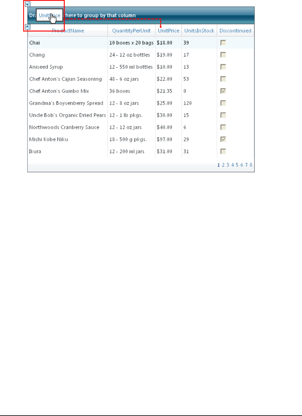
30
Note that that the grid will be grouped by that column:

31
3. Ungroup the grid by clicking the column in the grouping area, and dragging it back to the grid header.
4. Sort a column, by clicking the LinkButton in a column's header. In the following image, the ProductName
column has been sorted:
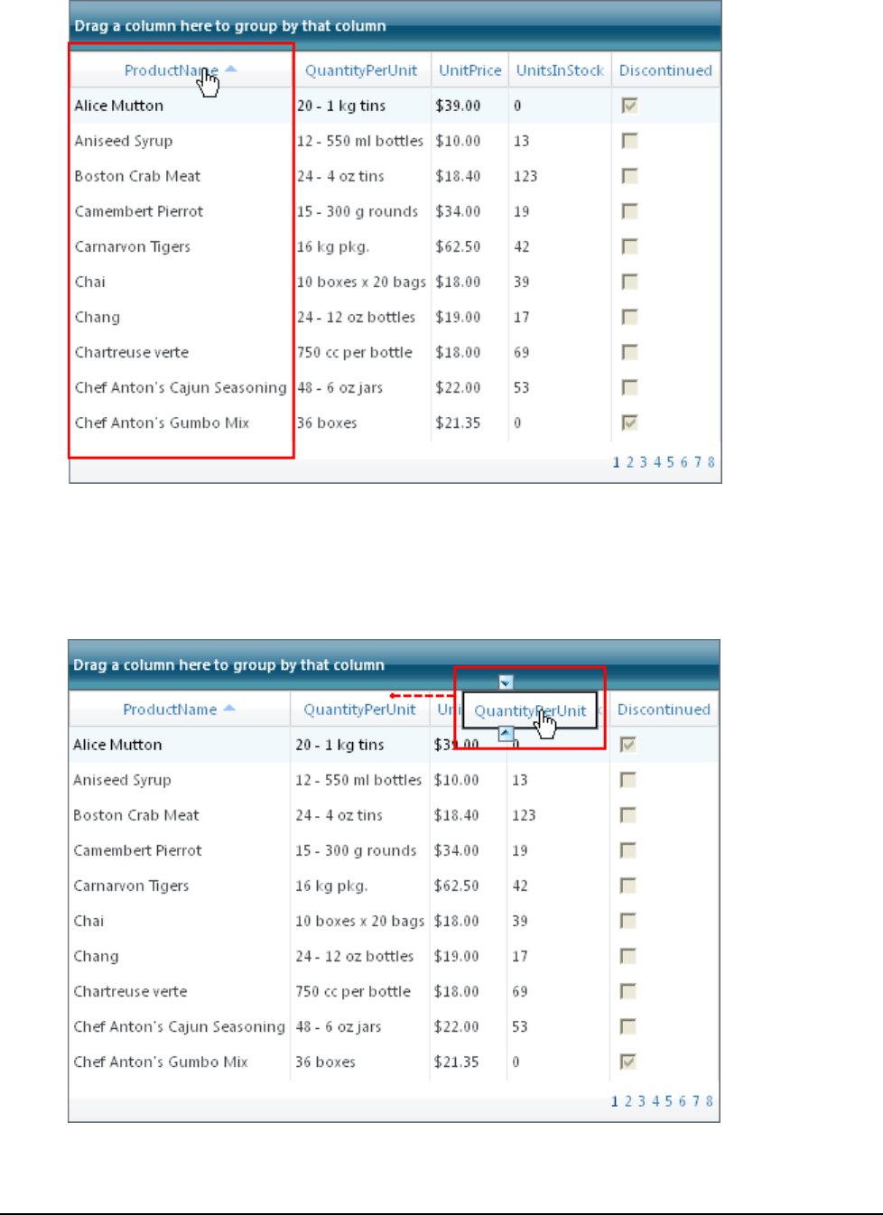
32
Note that an arrow sort indicator appears in the header of the sorted column.
5. Move a column by clicking on a column header once and dragging it to another location in the grid's
header. Note that arrow icons will appear indicating that the column can be dropped at that location:

33
6. Page forward in the grid, by clicking once on a page indicator at the bottom of the grid:
Congratulations! You've completed the C1GridView quick start. If you'd like to continue exploring GridView for
ASP.NET AJAX, see the GridView for ASP.NET AJAX Samples (page 57) and take a look at the GridView for
ASP.NET AJAX Task-Based Help (page 58) topics.
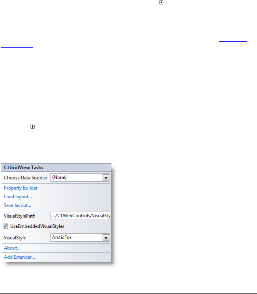
35
Design-Time Support
GridView for ASP.NET AJAX provides visual editing to make it easier to create a grid application. The following
sections describe how to use C1GridView's design-time environment to configure the C1GridView control:
Tasks Menu
A smart tag represents a shortcut tasks menu that provides the most commonly used properties in each control.
You can invoke each control's tasks menu by clicking on the smart tag ( ) in the upper-right corner of the control.
For more information on how to use the smart tag in C1GridView, see C1GridView Smart Tag (page 35).
Context Menu
The context menu represents a shortcut menu that provides common Visual Studio commands, as well as
commands specific to the C1GridView control. You can display the C1GridView context menu by right-clicking
anywhere on the grid. For more information on how to use the context menu in C1GridView, see C1GridView
Context Menu (page 37).
Property Builder
Quickly customize the appearance and behavior of the C1GridView control using the C1GridView Properties
dialog box. For more information on how to access and use the Property builder in C1GridView, see Property
Builder (page 38).
Properties Window
You can also easily configure C1GridView at design time using the Properties window in Visual Studio. You can
access the Properties window by right-clicking the control and selecting Properties.
C1GridView Smart Tag
A smart tag ( ) represents a short-cut Tasks menu that provides the most commonly used properties of a
component.
To access the C1GridView Tasks menu, click the smart tag in the upper-right corner of the C1GridView control.
The C1GridView Tasks menu appears.

36
Note that when the grid is bound to a data source, the Tasks menu lists additional options and appears similar to
the following:
Choose Data Source
Choose an existing data source or create a new connection through the Data Source Configuration Wizard. See
Binding the Grid to a Data Source (page 58) for more information.
Configure Data Source
This option invokes the Data Source Configuration Wizard to configure the data source. This option only
appears if the C1GridView control is bound to a data source.
Refresh Schema
This option refreshes the data source's schema. This option only appears if the C1GridView control is bound to a
data source.
Property builder
Opens the Property builder where you can set properties and customize the grid. See Using the Property Builder
(page 60) for more information.
Opens the About ComponentOne Studio for ASP.NET AJAX dialog box which displays the version number as
well as licensing, registration and purchasing information, and additional online resources.
Load Layout
Allows you to load an XML layout file. When you click this option the Open dialog box opens allowing you to
select a file to load.
Save Layout
Allows you to save the layout file as an XML file. When you click this option the Save dialog box opens allowing
you to select a file to load.
VisualStylePath

37
The VisualStylePath property specifies the location of the visual styles used for the control. By default, embedded
visual styles are located in ~/C1WebControls/VisualStyles. If you create a custom style, add it to this location
~/VisualStyles/StyleName/C1GridView/styles.css, set the VisualStylePath property to ~/VisualStyles, and set
the VisualStyle property to StyleName (assuming that StyleName is the name used to define the style in the
style.css file). Uncheck the UseEmbeddedVisualStyles property.
UseEmbeddedVisualStyles
This check box is checked by default so that the internal visual styles, such as ArcticFox and Vista can be used. If
you want to use your own custom styles, uncheck this check box and specify the location of your visual styles
using the VisualStylePath property.
Visual style
The Visual style drop-down box allows you to set the VisualStyle property and change the C1GridView control's
appearance to one of the predefined themes. By default this is set to the ArcticFox theme.
Edit Templates
Clicking this option invokes Template Editing Mode.
About
Opens the About ComponentOne Studio for ASP.NET AJAX dialog box which displays the version number as
well as licensing, registration and purchasing information, and additional online resources.
C1GridView Context Menu
Right-click anywhere on the grid to display the C1GridView context menu, which is a context menu that Visual
Studio provides for all .NET controls, although the C1GridView context menu has a few extra features.
The context menu commands operate as follows:
Show Smart Tag
This option shows the smart tag for the C1GridView control. For more information on how to use the smart tag
and available features, see C1GridView Smart Tag (page 35).

38
Edit Template
Select Edit Template to edit the EmptyData Template or Pager Template. Choosing one of these options will
invoke Template Editing Mode.
End Template Editing
This option ends Template Editing Mode if you're currently editing a template. If you're not in Template Editing
Mode, this option will not be available.
Property Builder
The Property builder allows you to easily customize the appearance and behavior of the C1GridView control. To
access the Property builder, select Property builder from the C1GridView Tasks menu (see C1GridView Smart
Tag (page 35) for details). The C1GridView Properties dialog box appears:
The C1GridView Properties window consists of five tabs:
Tab
Description
General
Displays the data source and allows you to set headers, footers, and

39
sorting properties.
Columns
Allows you to specify the types of columns that appear and set the
properties for each.
Paging
Lets you determine whether paging is used, and allows you to customize
how and where it appears.
Format
Allows you to set the font, color and alignment of the grid and
everything within it, including the headers, footers, the pager, specific
items, and columns.
Grouping
Lets you set column grouping properties and determine how the group
header and footer rows should be formatted and displayed.
General Tab
The General tab of the Property builder displays the data source and allows you to set headers, footers, and
sorting properties. The General tab consists of Data, Header and Footer, and Behavior settings:
The General tab includes the following options:
DataSource: Displays the current data source. For information about data binding, see Binding the Grid
to a Data Source (page 58).
DataMember: Displays the current data member.
Show header: When this check box is selected (default) the ShowHeader property is set to True and the
grid's header is visible.
Show footer: When this check box is selected the ShowFooter property is set to True and the grid's header
is visible. For an example, see Setting the Footer Text (page 66). By default, this check box is not selected
and ShowFooter is False.
Allow sorting: When this check box is selected the AllowSorting property is set to True and users can sort
the grid at run time. By default, this check box is not selected and AllowSorting is False. For more
information about sorting, see the Sorting (page 52) topic.

40
Columns Tab
The Columns tab of the Property builder allows you to specify the types of columns that appear and set the
properties for each. The Columns tab consists of Column generation, Column list, and Column properties
sections:
The Columns tab includes the following options and sections:
Create columns automatically at run time: When this check box is selected (default) the
AutoGenerateColumns property is set to True and column objects are generated and displayed
automatically. Note that when the grid is bound, this option may be automatically deselected.
Available columns: This window lists the available column types. Available column types include:
C1Band: displays a banding column used to create multilevel column headers.
C1BoundField: displays a column bound to a field in a data source.
C1ButtonField: displays a command button for each item.
C1CheckBoxField: displays a Boolean check box for each item.
C1CommandField: displays a column containing editing commands for each item.
C1HyperLinkField: displays each item as a hyperlink.
C1TemplateField: displays each item in the column following a specified template.
When the grid is bound to a data source, the columns available from that data source will be listed under
the Data Fields option in the Available columns window.

41
Selected columns: This window lists the current selected columns. When the grid is bound to a data
source, the bound columns will appear in this window.
To add a columns to the Selected columns list, choose a column in the Available columns list and click
the Move arrow button to move the item to the Selected columns list.
To move the order of columns, select the Up and Down arrows to the right of the window. To remove a
column from the list, click the Delete button to the right of the window.
Column properties: This list displays the available properties for a column. To change a column's
properties, click on that column in the Selected columns list and click the text box or drop-down arrow
next to a property in the Column properties window to modify its value.
Paging Tab
The Paging tab of the Property builder allows you to determine whether paging is used and lets you customize
how and where it appears. For more information about paging, see the Paging (page 54) topic. The Paging tab
includes the Paging and Page Navigation sections:
The Paging tab includes the following options:
Allow paging: When this check box is selected the AllowPaging property is set to True and paging is
included in the grid. See the Adding Paging (page 85) topic for an example. By default this check box is
unchecked and AllowPaging is False.
Allow custom paging: When the Allow paging check box is selected, this option is available. When this
check box is selected the AllowCustomPaging property is set to True and custom paging is allowed. By
default this check box is unchecked and AllowCustomPaging is False.

42
Page size: When the Allow paging check box is selected, this option is available. The Page size text box
sets the PageSize property and allows you to choose how many items are visible on the grid on each page.
By default, PageSize is 10.
Show navigation: This option is available when the Allow paging check box is selected. When this check
box is selected (default) the PagerSettings.Visible property is set to True and paging controls appear on the
grid.
Position: This option is available when the Allow paging and Show navigation check boxes are selected.
This option sets the PagerSettings.Position property and lets you determine where the pager controls will
appear in the grid. Options include:
Bottom: Paging controls will appear at the bottom of the grid. This is the default setting.
Top: Paging controls will appear at the top of the grid.
TopAndBottom: Paging controls will appear both at the top and bottom of the grid.
Mode: This option is available when the Allow paging and Show navigation check boxes are selected.
This option sets the PagerSettings.Mode property and lets you determine what kind of pager controls
should appear on the grid. Options include:
NextPrevious: Previous and Next button pager controls will used.
Numeric: Numbered link button pager controls that allow users to access pages directly will be used .
This is the default setting.
NextPreviousFirstLast: Previous, Next, First, and Last button pager controls will be used.
NumericFirstLast: Numbered and First, and Last button pager controls will be used.
Buttons count: This option is only available when the Numeric or NumericFirstLast Mode is selected
and it sets PagerSettings.PageButtonCount property and determines the number of page buttons to display
in the pager control. By default, PageButtonCount is 10.
First page text, First page image URL, Last page text, and Last page image URL: These options are
only available when the NextPreviousFirstLast or NumericFirstLast Mode is selected:
The First page text option sets the FirstPageText property and determines the text to display for the
First page button.
The First page image URL option sets the FirstPageImageUrl property and determines the image to
display for the First page button. Click the button next to the First page image URL text box to select
an image.
The Last page text option sets the LastPageText property and determines the text to display for the
Last page button.
The Last page image URL option sets the LastPageImageUrl property and determines the image to
display for the Last page button. Click the button next to the Last page image URL text box to select
an image.
Next page text, Next page image URL, Previous page text, and Previous page image URL: These
options are only available when the NextPrevious or NextPreviousFirstLast Mode is selected:
The Next page text option sets the NextPageText property and determines the text to display for the
Next page button.
The Next page image URL option sets the NextPageImageUrl property and determines the image to
display for the Next page button. Click the button next to the Next page image URL text box to select
an image.
The Previous page text option sets the PreviousPageText property and determines the text to display
for the Previous page button.

43
The Previous page image URL option sets the PreviousPageImageUrl property and determines the
image to display for the Previous page button. Click the button next to the Previous page image URL
text box to select an image.
Format Tab
The Format tab of the Property builder allows you to set the font, color and alignment of the grid and everything
within it, including the headers, footers, the pager, specific items, and columns. The Format tab includes the
Objects, Columns, and Column properties sections:
The Format tab includes the following sections:
Objects: Displays the available objects. Choose a object to set it's formatting properties in the Column
properties window.
Columns: Displays the list of available columns. If the grid is bound, the bound columns will appear in
this list. Choose a column to set it's formatting properties in the Column properties window.
Column properties: When an object or column is selected from the appropriate pane, the Column
properties window displays the available formatting properties that can be set for that object or column.
Grouping Tab
The Grouping tab of the Property builder allows you to set column grouping properties and determine how the
group header and footer rows should be formatted and displayed. For more information about grouping, see the
Grouping (page 49) topic. The Grouping tab includes the Column list and Grouping properties sections:

44
The Grouping tab includes the following sections:
Column list: Displays the list of available columns. If the grid is bound, the bound columns will appear in
this list. Choose a column to set it's grouping properties in the Grouping properties window.
Grouping properties: When an column is selected from Column list, the Grouping properties window
displays the available grouping properties that can be set for that column. You can customize grouping
behavior and set how the group header and footer rows should be formatted and displayed.
Using GridView for ASP.NET AJAX
ComponentOne GridView for ASP.NET AJAX allows you to select, edit, delete, filter, and sort the items
displayed in the table generated by the C1GridView component. GridView for ASP.NET AJAX also supports
paging, so data can be displayed across multiple pages, which are accessed by default or customized navigation
buttons.
The columns of a table created using the C1GridView component correspond to the fields in a data source. You
can control which columns are displayed, the types of columns to display, and the appearance of the whole table.
Using the AutoGenerateColumns property, you can generate columns automatically, manually, or both. Setting
this property to True (default) creates a C1BoundField for each field in the data source. Setting this property to
False allows you to specify the columns to display, which are added to the Columns collection.
Note: Explicitly declared columns are rendered first, followed by automatically generated columns. Automatically
generated columns are not added to the Columns collection.
Class Hierarchy

45
The following list summarizes the class relationships between the more important classes included in the
GridView for ASP.NET AJAX:
C1.Web.UI.Controls.C1GridView.C1GridView : System.Web.UI.WebControls.WebControl
Encapsulates most of the grid functionality. This component is shown in the Visual Studio's Toolbox.
C1.Web.UI.Controls.C1GridView.C1Field : System.Object
Base class for columns.
C1.Web.UI.Controls.C1GridView.C1GridViewRow : System.Web.UI.WebControls.TableRow
Grid items.
C1.Web.UI.Controls.C1GridView.C1GridViewRowCollection : System.Collections.CollectionBase
Collection of items.
C1.Web.UI.Controls.C1GridView.PagerStyle : System.Web.UI.WebControls.TableItemStyle
Style of the Pager. Determines if and how the pager is displayed.
C1.Web.UI.Controls.C1GridView.GroupInfo : System.Object
Used to determine how and where grouped header and footer rows are displayed.
Visual Styles
C1GridView includes Visual Styles allowing you to easily change the control's appearance. The control includes
several built-in visual styles, including Vista and Office 2007 styles, to quickly style your application. You can
easily change Visual Styles from the Properties window and in code. For more information on changing Visual
Styles see the Changing the Visual Style (page 47) topic.
The following Visual Styles are included in GridView for ASP.NET AJAX:
Theme
Description
ArcticFox (default)
The default ArcticFox theme.
Office2007Black
Mimes the Office 2007 black theme.
Office2007Blue
Mimes the Office 2007 blue theme.
Office2007Silver
Mimes the Office 2007 silver theme.
Vista
Mimes the Vista theme.
ArcticFox
The following image displays the ArcticFox theme. This is the default appearance of C1GridView:

46
Office2007Black
The following image displays the Office2007Black theme:
Office2007Blue
The following image displays the Office2007Blue theme:
Office2007Silver
The following image displays the Office2007Silver theme:

47
Vista
The following image displays the Vista theme:
Changing the Visual Style
You can change the theme of a C1GridView at design time using the Properties window:
1. Click the C1GridView control once to select it, and navigate to the Properties window.
2. In the Properties window, click the VisualStyle drop-down arrow and select a style, for example Vista.
The VisualStyle property is set to the option you selected and the theme is applied to your grid.
Customizing the Control's Appearance
If you choose to completely customize the appearance of the C1GridView control you may not wish to use any of
the available built-in Visual Styles. In that case, to override any visual styles with your own custom appearance,
you will need to set the UseEmbeddedVisualStyles property to False and create your own visual style using CSS.
To create your own visual style using CSS, you will need to do three things: add a custom style sheet to your
project, set the UseEmbeddedVisualStyles property to False, and set the VisualStylePath and VisualStyle
properties.
Step 1: Add a Custom Style Sheet
In order to create your own custom style, you must add a style sheet to your project. The VisualStylePath property
determines the location of your visual style.

48
Step 2: Set the UseEmbeddedVisualStyles Property
The UseEmbeddedVisualStyles property allows you to override built-in visual styles with your own custom
appearance. By default C1GridView.UseEmbeddedVisualStyles property is True and Visual Styles are used. Any
customizations you make while using Visual Styles will simply set specific elements in the control's appearance on
top of the current Visual Style. To start customizing the control's appearance from scratch set
C1GridView.UseEmbeddedVisualStyles to False and set your own styles.
Step 3: Set the VisualStylePath and VisualStyle Properties
Once you have created a custom visual style and set the UseEmbeddedVisualStyles to False you must assign the
C1GridView control's the VisualStylePath and VisualStyle properties to the visual style directory and the visual
style name that you are using. For example, the VisualStylePath should be set to ~/VisualStyles and the
VisualStyle property should be set to StyleName (assuming that StyleName is the name used to define the style in
the styles.css file.
Keyboard Navigation
At run time you can navigate through the grid using keyboard navigation. Available keyboard navigation is similar
to products like Microsoft Excel, to make it easier for users to intuitively navigate the grid. Keyboard navigation
also allows greater accessibility in navigating and manipulating the grid.
The following table describes the possible interactions:
Option
Description
Up Arrow
Moves the current cell in focus, indicated by the currency marquee, one cell up.
Down Arrow
Moves the current cell in focus, indicated by the currency marquee, one cell down.
Left Arrow
Moves the current cell in focus, indicated by the currency marquee, one cell to the
left.
Right Arrow
Moves the current cell in focus, indicated by the currency marquee, one cell to the
right.
Home
Moves the current cell in focus, indicated by the currency marquee, to the first cell
of the current row.
End
Moves the current cell in focus, indicated by the currency marquee, to the last cell
of the current row.
Enter
Moves the current cell in focus, indicated by the currency marquee, one cell down.
Page Up
Moves the current cell in focus, indicated by the currency marquee, to the first cell
of the current column.
Page Down
Moves the current cell in focus, indicated by the currency marquee, to the last cell
of the current column.
Tab
If the TabNavigation property is set to ControlNavigation, current cell navigation
will follow the input focus of the controls in the grid (if there are any). If
TabNavigation is TabNavigation, the current cell will cycle from the left to the right
and from the top to the bottom. When navigation reaches the bottom right most cell
pressing the Tab key will jump the current cell to the upper left most grid cell.
Alphanumeric key
When a cell is selected, typing any alphanumeric key enters the client-side editing
mode on the cell.
Editing Rows
Each row in the C1GridView component represents a record in the data source. You can select, edit, delete, and
apply different styles to your rows.

49
If you are creating data manually, by adding a C1ButtonField and code for the RowEditing,
C1GridView.UpdateCommand and RowCancelingEdit events, you can select each row to be edited or deleted. If
you connect to the data source control, this is all taken care for you automatically.
The EditRowStyle property allows you to determine the appearance of the rows. For additional information on
editing rows, see GridView for ASP.NET AJAX Task-Based Help (page 58).
The RowMerge property allows you to merge rows containing identical text. You can use the Property builder to
specify which rows to merge and how they are merged. For additional information, see Merging Rows (page 81).
You can use AJAX to update the grid when the user edits a record at run time by setting the CallbackOptions
property. For more information, see Editing a Record (page 90).
Grouping
The C1GridView data grouping features allow you to automatically calculate data aggregates and create trees with
nodes that can be collapsed and expanded.
At run time, users can group data if the AllowGrouping property has been set to True (by default it is set to False).
If AllowGrouping had is True, a grouping area will appear at the top of the grid:
To group at run time, simply drag a column header into the grouping area. Note that you may need to set the
AllowColMoving property to True to allow run-time column manipulation.
The C1GridView data grouping features are controlled by two properties of the C1Field class:
The GroupInfo property determines whether a group should be created for the column, as well as the
appearance, position, and content of the group header and group footer rows.
The Aggregate property determines the type of aggregate that should be calculated for this column and
included in the group header and footer rows.
Typically, you will set the GroupInfo property for columns that contain categories that you would like to group on
(for example, OrderYear, Country, and so on). You will set the Aggregate property for columns that contain the
values that you want to aggregate on (for example, Amount, Sales, Expenses, and so on).
You can customize the text that appears in the grouping area by setting the GroupByCaption property.
Setting Grouping Properties at Design Time
You can set up the Grouping properties at design time using the Property builder. You will use three tabs in the
C1GridView Properties dialog box to set up each aspect of data grouping:
Grouping tab: This tab contains a list of columns. For each column that you want to group on, set the
Position property to determine where the group header and footer rows should be displayed (set Position
to None to remove grouping for a column). Also set the HeaderText (and/or FooterText) property to
determine what will be displayed in the group header/footer rows. Optionally, set up the group header
and footer styles. See Grouping Tab (page 43) for more information.

50
Columns tab: Set the Aggregate property on each column that you want to aggregate on. Usually, these
will be columns that contain numeric values, and will not be grouped on. See Columns Tab (page 40) for
more information.
Format tab: Select each column that you are grouping on and set the styles for the group header and
group footer rows. Typically, you will set the background color so the group headers and footers stand out
from the regular rows. See Format Tab (page 43) for more information.
For additional information on the Property builder, see Using the Property Builder (page 60).
Setting Grouping Properties at Run Time
You can also set the Grouping properties at run time. This gives you extra flexibility because you can set up the
grouping based on user selections.
For example, the code below configures the grid to display the same data in one of four modes selectable by the
user (the full sample is available in the distribution package):
Visual Basic
Private Sub _rblView_SelectedIndexChanged(ByVal sender As Object, ByVal e
As System.EventArgs)
' set up grouping/merging
Dim col As C1.Web.UI.Controls.C1GridView.C1Field =
C1GridView1.Columns(0)
Select Case _rblView.SelectedItem.Text
' Traditional Mode: no grouping or merging
Case "Traditional"
col.Visible = True
col.RowMerge = C1.Web.UI.Controls.C1GridView.RowMerge.None
col.GroupInfo.Position =
C1.Web.UI.Controls.C1GridView.GroupPosition.None
' Merged: no grouping, similar values merged down the columns
Case "Merged"
col.Visible = True
col.RowMerge = C1.Web.UI.Controls.C1GridView.RowMerge.None
col.GroupInfo.Position =
C1.Web.UI.Controls.C1GridView.GroupPosition.None
' Grouped: grouped with collapsible headers, grouped values
merged.
Case "Grouped"
col.Visible = True
col.RowMerge = C1.Web.UI.Controls.C1GridView.RowMerge.None
col.GroupInfo.Position =
C1.Web.UI.Controls.C1GridView.GroupPosition.Header
' Summary: grouped with collapsible headers, grouped values
hidden.
Case "Summary"
col.Visible = False
col.RowMerge = C1.Web.UI.Controls.C1GridView.RowMerge.None
col.GroupInfo.Position =
C1.Web.UI.Controls.C1GridView.GroupPosition.Header
End Select
End Sub
C#

51
private void _rblView_SelectedIndexChanged(object sender, System.EventArgs
e)
{
// set up grouping/merging
C1.Web.UI.Controls.C1GridView.C1Field col = C1GridView1.Columns[0];
switch (_rblView.SelectedItem.Text)
{
// Traditional Mode: no grouping or merging
case "Traditional":
col.Visible = true;
col.RowMerge = C1.Web.UI.Controls.C1GridView.RowMerge.None;
col.GroupInfo.Position =
C1.Web.UI.Controls.C1GridView.GroupPosition.None;
break;
// Merged: no grouping, similar values merged down the columns
case "Merged":
col.Visible = true;
col.RowMerge = C1.Web.UI.Controls.C1GridView.RowMerge.None;
col.GroupInfo.Position =
C1.Web.UI.Controls.C1GridView.GroupPosition.None;
break;
// Grouped: grouped with collapsible headers, grouped values
merged.
case "Grouped":
col.Visible = true;
col.RowMerge = C1.Web.UI.Controls.C1GridView.RowMerge.None;
col.GroupInfo.Position =
C1.Web.UI.Controls.C1GridView.GroupPosition.Header;
break;
// Summary: grouped with collapsible headers, grouped values
hidden.
case "Summary":
col.Visible = false;
col.RowMerge = C1.Web.UI.Controls.C1GridView.RowMerge.None;
col.GroupInfo.Position =
C1.Web.UI.Controls.C1GridView.GroupPosition.Header;
break;
}
}
Sample Project Available
For the complete sample, see the Grouping sample located on the ComponentOne HelpCentral Sample page.
Collapsing and Expanding Groups
GridView for ASP.NET AJAX generates client-side script that allows users to collapse and expand the groups
without round trips to the server.
If you set the OutlineMode property to StartCollapsed or StartExpanded, the grid will display
expanded/collapsed icons next to each group header row. The users can click these icons to collapse and expand
the groups to see the overall structure or the details of the data.
The behavior for the outline nodes is as follows:

52
Click:
o If the node is currently expanded, it becomes collapsed. All subordinate group headers and data are
hidden.
o If the node is currently collapsed, it becomes expanded. If there are any subordinate group headers,
they are displayed in the collapsed state. If there are no subordinate group headers, the data is
displayed.
SHIFT-Click:
o All nodes and data below the node that was clicked are displayed.
You can select different icons for the group headers using the CollapsedImageUrl and ExpandedImageUrl
properties.
For additional information on grouping, see the GridView for ASP.NET AJAX Task-Based Help (page 58).
Sorting
The C1GridView control provides built-in sorting functionality without requiring any coding. You can further
customize the sort functionality of the C1GridView control by using custom SortExpression property values for
columns as well as by using the Sorting and Sorted events.
You can enable the default sorting behavior in the C1GridView control by setting its AllowSorting property to
True. When AllowSorting is True, the C1GridView control renders a LinkButton control in the column headers
and implicitly sets the SortExpression property of each column to the name of the data field to which it is bound.
For example, if the grid contains a column that displays the City column of the Employees table in the Northwind
sample database, the SortExpression of that column will be set to City. You can determine or set the sort direction
with the SortDirection property (Ascending, Descending, or None).
At run time, users can click the LinkButton control in a column heading to sort by that column. Clicking the link
causes the page to perform a postback and raises the C1GridView control's Sorting event. After the query has
executed, the grid's Sorted event is raised. Finally, the data source control rebinds the C1GridView control to the
results of the resorted query. When a column is sorted, the column header will display a sort indicator at run time
(an arrow icon) indicating the direction of the sort.
In the following image, the Price column was sorted:
Note that if the data source control does not support sorting and a sorting operation is performed in the
C1GridView control, the C1GridView control throws the NotSupportedException exception. You can catch this

53
exception in a handler for the Sorting event and check the data source to determine whether sorting is supported,
or by using your own sorting logic.
You can use AJAX to update the grid when the user sorts a column at run time by setting the CallbackOptions
property. For an example, see Sorting Columns (page 92).
Filtering
The C1GridView control provides built-in data filtering functionality without requiring any coding. To be able to
filter data at run time, the ShowFilter property must be set to True (by default this is False). When ShowFilter is
True a filter bar appears at the top of the grid just under the grid's column headings.
To filter data in the grid at run time, simply type text in the filter bar and press ENTER. To remove the filter,
delete the text in the filter bar and press ENTER. In the following image, the ProductName column of the Products
table has been filtered by the word "sauce":
You can choose what the filter condition should be by setting the FilterOperator property (note that you can set
this property in the Columns tab of the Property builder). By default FilterOperator is set to Contains, but you can
set the FilterOperator to the following options:
Option
Description
NoFilter
No filter is applied.
Contains (default)
The filter term is contained in the column.
NotContain
The filter term is not contained in the column.
BeginsWith
Items in the column begin with the filter term.
EndsWith
Items in the column end with the filter term.
Equals
Items in the column equal the filter term exactly.
NotEqual
Items in the column do not equal the filter term exactly.
Greater
Items in the column are less than the (numeric) filter term.
Less
Items in the column are greater than the (numeric) filter term.
GreaterOrEqual
Items in the column are greater than or equal to the (numeric) filter term.
LessOrEqual
Items in the column are less than or equal to the (numeric) filter term.
IsEmpty
Items in the column are empty.
NotIsEmpty
Items in the column are not empty.
IsNull
Items in the column are null.
NotIsNull
Items in the column are not null.
Custom
Custom filter is applied.

54
You can customize the appearance of the filter bar by setting the FilterStyle property. To show a filter button, you
should either set AutoGenerateFilterButton to True or manually create a C1CommandField and set its
ShowFilterButton property to True. If no filter button is visible, the user can trigger the filter by pressing the
ENTER key.
You can use AJAX to update the grid when the user filters columns at run time by setting the CallbackOptions
property. For more information, see Filtering Columns (page 92).
Paging
The C1GridView control provides built-in data paging functionality without requiring any coding. By default the
grid is displayed in one continuous window. If you choose, you can display the grid on multipage "pages". If
paging is set, at run time users can navigate each page of the grid through buttons or links at the top or bottom of
the grid. For an example of adding paging, see the Adding Paging (page 85) topic.
To be able to page data at run time, the AllowPaging property must be set to True (by default this is False). When
AllowPaging is True paging navigation appears by default at the bottom of the grid in the grid's footer. You can
change the position of the paging controls, if you choose, by setting the Position property. By default, 10 items
appear on each page of the grid. You can change this number, by setting the PageSize property. For example, in
the image below the PageSize has been set to 4.
By default the paging controls appear as numeric links:
You can change the appearance of the paging controls by setting the Mode property. You can set the Mode
property to the following options:
Mode
Description
NextPrevious
A set of pagination controls consisting of Previous and Next buttons.
Numeric (default)
A set of pagination controls consisting of numbered link buttons to access pages
directly.
NextPreviousFirstLast
A set of pagination controls consisting of Previous, Next, First, and Last buttons.
NumericFirstLast
A set of pagination controls consisting of numbered and First and Last link buttons.
To customize the style of the pager controls, you can set the PagerStyle property. For an example of changing the
pager mode and style, see the Changing Paging Types and Styles (page 86) topic. Note that the paging properties
are easily accessed at design time on the Paging tab of the Property builder (the C1GridView Properties dialog
box).
You can use AJAX to update the grid when the user pages the grid at run time by setting the CallbackOptions
property. For more information, see Paging the Grid (page 90).

55
Using AJAX
Asynchronous JavaScript and XML (AJAX) provides a very effective way of communicating with data which
resides on a server. This means that Web pages (ASP.NET Web applications) can execute server-side logic and
update various page elements without reloading the entire page. This is a highly efficient way to present data via
Web applications. It saves page reloading time and provides a more streamlined user experience.
AJAX allows GridView for ASP.NET AJAX to load data without having to do a postback to the server,
minimizing load time and greatly improving the end-user experience. Using C1GridView's Callback feature, the
grid calls back to the server to retrieve only the information that is requested, unlike with a server postback, where
the whole page must be reloaded to update the grid. End-users can quickly modify a grid without that annoying
flicker of the screen during load time.
You can use the Callback feature for editing the grid, grouping and outlook grouping, paging, row selection,
sorting, and scrolling the grid by simply setting C1GridView's CallbackOptions property to one of the following
options:
None: All actions are performed via postback.
ColMove: Column moving is performed via callbacks.
Editing: Editing is performed via callbacks.
Paging: Paging is performed via callbacks.
Selection: Row selection is performed via callbacks.
Sorting: Sorting is performed via callbacks.
Filtering: Filtering is performed via callbacks.
All: All actions on the grid are performed via callbacks.
For more information on using GridView for ASP.NET AJAX and AJAX, see the Updating the Grid with AJAX
(page 89) topic.
Client-Side Functionality
GridView for ASP.NET AJAX has a very rich client-side object model as it is similar to the object model in the
server-side control.
When a C1GridView control is rendered, an instance of the client-side grid will be created automatically. This
means that you can enjoy the convenience of accessing any property and method of the C1GridView control
without having to postback to the server.
For example, suppose a C1GridView control with name C1GridView1 is hosted on Web page; When the page is
rendered, a corresponding client-side grid object will be created. Use the following syntax to get the client-side
object on a Web page:
$get("C1GridView1").control
OR
$find("C1GridView1")
By using GridView for ASP.NET AJAX's client-side code, you can implement many features in your Web page
without the need to take up time by sending information to the Web server. Thus, using client-side code can
increase the efficiency of your Web site.
Client-Side Properties
The following conventions are used when accessing the client object properties:

56
Server properties on the client are implemented as a pair of Get- and Set- methods.
Method names must start with "get_" (Get-method) and "set_" (Set-method) followed with the server
property name. The first letter of the server property name must be lowercase.
For example in the code below the C#, Visual Basic, and JavaScript examples are equivalent:
Visual Basic
Dim mov As String = C1GridView1.AllowColMoving
C1GridView1.AllowColMoving = mov
C#
string mov = C1GridView1.AllowColMoving;
C1GridView1.AllowColMoving = mov;
JavaScript
grid = $get("C1GridView1").control;
var mov = grid.get_allowColMoving();
set_allowColMoving(mov);

57
GridView for ASP.NET AJAX Samples
Please be advised that this ComponentOne software tool is accompanied by various sample projects and/or
demos, which may make use of other ComponentOne development tools included with the ComponentOne
Studios.
Samples can be accessed from the ComponentOne Sample Explorer. To view samples, on your desktop, click the
Start button and then click All Programs | ComponentOne | Studio for ASP.NET | Samples | Palomino
Samples.
C# Samples
ComponentOne GridView for ASP.NET AJAX includes several C# samples; the following pages within the
ControlExplorer sample installed with ComponentOne Studio for ASP.NET AJAX detail the C1GridView
control's functionality:
Sample
Description
Aggregates
This sample demonstrates automatic row spanning, grouping and, aggregates.
The grouped and summary views can be collapsed or expanded with the
mouse. Totals are calculated automatically by the grid.
ClientSideEditing
This sample demonstrates how to add, edit, and delete records entirely on the
client, making data entry faster and more intuitive.
ClientSideSelection
This sample demonstrates how to allow end-users to select single, range, or
multiple cells, rows, or columns.
Columns
This sample demonstrates column settings and interactions. C1GridView
supports bands to organize columns into hierarchical structure implementing
multilevel column headers. You can re-arrange columns using drag-and-drop
operations, resize columns, and sort a column by clicking its header.
Currency
This sample demonstrates how the C1GridView control's currency (current
chosen cell) can be changed by mouse and keyboard interaction.
CustomHierarchy
This sample shows a custom hierarchical grid created by deriving a custom
class from C1GridView and using column templates.
Editing
This sample shows how you can edit data using C1GridView.
Filtering
This sample shows how you can filter data using C1GridView, and
demonstrates filter options.
Grouping
This sample details C1GridView's grouping functionality.
OutlookGrouping
This sample shows Outlook-style grouping using drag-and-drop operations on
the client-side.
Paging
This sample shows how you can customize paging.
Scrolling
This sample shows different scrolling options with fixed rows and column.
VisualStyles
Details the visual styles supported by C1GridView.

58
GridView for ASP.NET AJAX Task-
Based Help
The task-based help assumes that you are familiar with programming in Visual Studio .NET, know what a DataSet
is, and know how to use bound controls in general. By following the steps outlined in the help, you will be able to
create projects demonstrating a variety of C1GridView features and get a good sense of what C1GridView can do.
The help uses the standard Northwind Access database, Nwind.mdb, for bound data, which is installed by default
in the ComponentOne Samples\Common folder in your MyDocuments folder (Documents in Vista). The
database is referred to by filename instead of the full pathname for the sake of brevity.
Note: Depending on where you store the projects and database files, you may need to change the location of the
Nwind.mdb reference in the projects.
Each task-based help topic also assumes that you have created a new ASP.NET project, have placed a bound
C1GridView control on the form, and have used the Imports (Visual Basic) or using (C#) statement for the
C1.Web.UI.Controls.C1GridView namespace and relevant System namespaces. For additional information, see
Creating an AJAX-Enabled ASP.NET Project (page 15), Binding the Grid to a Data Source (page 58), and
Namespaces (page 14).
Note: GridView for ASP.NET AJAX requires Microsoft ASP.NET AJAX Extensions installed and a ScriptManager on
the page before the C1GridView control is placed on the page. You must create an ASP.NET AJAX-Enabled Project
so that the ScriptManager and Microsoft AJAX Extensions are included on the page. For more information, see
Creating an AJAX-Enabled ASP.NET Project (page 15). For more information about Microsoft ASP.NET AJAX Extensions,
see http://ajax.asp.net/. For information about the ScriptManager, see MSDN.
Binding the Grid to a Data Source
The following topics demonstrate how to bind C1GridView to a data source control. The steps for binding
C1GridView to a data source are slightly different in a Web site project from a Web application project.
Binding the Grid in a Web Site Project
To bind C1GridView to a data source control in a Web Site project, complete the following steps:
1. In the Solution Explorer, right-click the App_Data folder, and then click Add Existing Item.
2. Locate the Nwind.mdb file, installed by default in the samples folder.
3. In the Add Existing item dialog box, click the Nwind.mdb file, and then click Add.
4. Go back to the Default.aspx page.
5. Select the C1GridView control, and click the Smart Tag (page 35) to open the C1GridView Tasks menu.
6. Click the Choose Data Source drop-down arrow and select <New data source>.
7. In the Data Source Configuration Wizard, select Access Database and click OK.
8. Click Browse and select App_Data under Project folders in the Select Microsoft Access Database dialog
box.
9. Choose Nwind.mdb in the Contents of folder pane on the right-hand side and click OK.
10. Click Next. The Configure the Select Statement window appears.
a. Confirm that the Specify columns from a table or view option is selected.

59
b. In the Name drop-down list, select Products.
c. In the Columns box, select ProductID, ProductName, QuantityPerUnit, and UnitsInStock or
desired other check boxes.
11. Click Next. The Test Query page appears. Optionally, click Test Query to test your query.
12. Click Finish to close the wizard and add the data source.
Binding the Grid in a Web Application Project
To bind C1GridView to a data source control in a Web Application project, complete the following steps:
1. In the project, select Project | Add Existing Item.
2. Locate and select the Nwind.mdb file, installed by default in the samples folder, and click Add. The Data
Source Configuration Wizard appears.
3. Check the Tables check box and click Finish.
4. Right-click the C1GridView control and then click Show Smart Tag.
5. On the C1GridView Tasks menu, click the Choose Data Source drop-down arrow and select <New data
source…>. The Data Source Configuration Wizard appears.
6. Select Access Database and click OK.
7. Click the Browse button and select the Nwind.mdb that appears under Contents of folder.
8. Click OK and then Next. The Configure the Select Statement window appears.
a. Make sure the Specify columns from a table or view option is selected.
b. In the Name drop-down list, select Products.
c. In the Columns box, select ProductID, ProductName, QuantityPerUnit, and UnitsInStock or other
desired check boxes.
9. Click Next. The Test Query page appears. Optionally, click Test Query to test your query.
10. Click Finish to close the wizard and add the data source.
Automatically Updating the Data Source
This topic illustrates how to create an editable grid using templates and a DataSource control. Complete the
following steps:
1. Create a grid and bind it to a DataSource control; see Binding the Grid to a Data Source (page 58) topic
for details. Use the Suppliers table in the Northwind database and retrieve the SupplierID, CompanyName,
ContactName, and Address fields.
2. Configure UpdateQuery:
a. Right-click the AccessDataSource1 component and then click Properties. In the Properties tab click the
ellipsis button next to UpdateQuery. The Command and Parameter Editor dialog box appears.
b. Click Query Builder, select the Suppliers table and click Add.
c. Insert the following text in UPDATE command and click OK to close the Query Builder:
UPDATE Suppliers SET CompanyName = ?, ContactName = ?, Address = ?
WHERE (SupplierID = ?)
d. Click the Add Parameter button and rename the parameter "SupplierID".
e. Click Show advanced properties and set the Type property to Int32
f. In the same way, add CompanyName, ContactName, Address parameters, but set their Types to String.

60
g. Click OK to close the Command and Parameter Editor dialog box.
3. Right-click the C1GridView control and then click Show Smart Tag.
4. On the C1GridView Tasks menu, in the Choose Data Source box, click AccessDataSource1, if
necessary.
5. Right-click the C1GridView control and click Properties. In the Properties window set the
DataKeyNames value to SupplierID.
Sample Project Available
For the complete sample, see the SimpleEdit sample located on the ComponentOne HelpCentral Sample page.
Using the Property Builder
The Property builder allows you to easily customize the appearance and behavior of the C1GridView control.
Using the Property builder, you can determine whether to show headers and footers, customize paging and page
navigation, and format the appearance of the C1GridView control.
To access the Property builder, select Property builder from the C1GridView Tasks menu.
The C1GridView Properties dialog box appears. For more information about the Property builder and the
available options, see the Property Builder (page 38) topic.
Setting Properties Using the Property Builder
The C1GridView Properties dialog box allows you to easily set properties to customize the C1GridView control's
appearance and behavior. To set properties using the Property builder, complete the following steps:
1. Right-click C1GridView and select Show Smart Tag from the context menu. Select Property builder from
the C1GridView Tasks menu.
The C1GridView Properties dialog box appears.
2. From the C1GridView Properties dialog box, select one of the following tabs in the left column. For this
example, the Columns tab is selected.
The C1GridView Properties dialog box includes five tabs as follows:
Tab
Description
General
Displays the data source and allows you to set headers, footers, and
sorting properties. See General tab (page 39) for more information.
Columns
Allows you to specify the types of columns that appear and set the
properties for each. See Columns tab (page 40) for more information.
Paging
You can determine whether paging is used, and you can customize how
and where it appears. See Paging tab (page 41) for more information.
Format
Allows you to set the font, color and alignment of the grid and
everything within it, including the headers, footers, the pager, specific
items, and columns. See Format tab (page 43) for more information.
Grouping
You can determine whether a column is grouped on and how the group
header and footer rows should be formatted and displayed. See
Grouping tab (page 43) for more information.
3. Choose one of the columns in the list of Selected columns.

61
4. Set the desired properties under Column properties and click Apply.
5. Once you are finished setting the properties, click OK.
Alternatively, C1GridView properties can be set using the Properties window at design time.
1. Select the C1GridView control.
2. Select Properties Window from the View menu on the Visual Studio toolbar.
3. In the Properties window, set any of the desired properties.
Adding Columns Using the Property Builder
Using the C1GridView Properties dialog box, you can also add and remove columns and determine the types of
columns to display. Available column types include:
C1Band: displays a banding column used to create multilevel column headers.
C1BoundField: displays a column bound to a field in a data source.
C1ButtonField: displays a command button for each item.
C1CheckBoxField: displays a Boolean check box for each item.

62
C1CommandField: displays a column containing editing commands for each item.
C1HyperLinkField: displays each item as a hyperlink.
C1TemplateField: displays each item in the column following a specified template.
To add columns, complete the following steps:
1. Right-click C1GridView control and select Show Smart Tag from the context menu. Select Property
builder from the C1GridView Tasks menu. The C1GridView Properties dialog box appears.
2. Click the Columns tab in the left pane. For more information about the Columns tab, see the Columns tab
(page 40) topic.
3. Under Column List, select the desired column from the list of Available columns.
4. Click the arrow button between the column lists to create a column under the list of Selected columns. In
the image below a HyperLink column was added:
Note: When the check box next to Create columns automatically at run time is checked (default),
bound columns are automatically created. If you uncheck the box, you must manually create columns.
Formatting the Grid's Content
The following task-based help topics explain how to format your grid, including customizing the grid's content,
column headers, footers, and more.
Customizing Columns Using DataFormatString
This topic demonstrates how to customize a column using the DataFormatString property.
In the Designer
Complete the following steps to set a column's DataFormatString property in the Property builder:
1. Right-click the C1GridView control and then click Show Smart Tag. On the C1GridView Tasks menu,
click Property builder. The C1GridView Properties window appears.
2. Select the Columns tab and choose a column in the Selected columns list. In this example, the
UnitsInStock column of the Northwind Products table was selected.
3. In the Column properties grid, set the DataFormatString property to "{0:N0} unit(s)".

63
In Source View
Switch to Source view and set the DataFormatString property by adding DataFormatString = "{0:N0}
unit(s)" to a C1BoundField column definition, so it appears similar to the following:
<cc1:C1BoundField DataField="UnitsInStock" HeaderText="Stock"
SortExpression="UnitsInStock" DataFormatString = "{0:N0} unit(s)">
In Code
Add the following code to the Page_Load event to format the column:
Visual Basic
' Format the UnitsInStock column.
CType(C1GridView1.Columns.ColumnByName("UnitPrice"),
C1.Web.UI.Controls.C1GridView.C1BoundField).DataFormatString = "{0:N0}
unit(s)"
C#
// Format the UnitsInStock column.
((C1.Web.UI.Controls.C1GridView.C1BoundField)C1GridView1.Columns.ColumnByN
ame("UnitPrice")).DataFormatString = "{0:N0} unit(s)";
What You've Accomplished
This example formats the data in the column as numbers followed by "unit (s)":
Note that when column data type is Date, DataFormatString is set to {0:d} for displaying the date in short date.
You can also set the DataFormatString property in the Columns tab of the Property builder.
Sample Project Available
For the complete sample, see the DataFormatString sample located on the ComponentOne HelpCentral Sample page.

64
Customizing Columns Using ValueLists
This topic demonstrates how to change the display of cell data using the ValueList property.
The ValueList property sets the object that implements the IDictionary interface used for textual substitution. In
order to substitute text, a dictionary containing replacement text must be created.
1. To create a ValueList dictionary, add the following code to the Page_Load event:
Visual Basic
'Prepare ValueList dictionary
Dim ht As New Hashtable()
ht.Add("1", "Beverages")
ht.Add("2", "Condiments")
ht.Add("3", "Confections")
ht.Add("4", "Dairy Products")
ht.Add("5", "Grains/Cereals")
ht.Add("6", "Meat/Poultry")
ht.Add("7", "Produce")
ht.Add("8", "Seafood")
C#
//Prepare ValueList dictionary
Hashtable ht = new Hashtable();
ht.Add("1", "Beverages");
ht.Add("2", "Condiments");
ht.Add("3", "Confections");ht.Add("4", "Dairy Products");
ht.Add("5", "Grains/Cereals");
ht.Add("6", "Meat/Poultry");
ht.Add("7", "Produce");
ht.Add("8", "Seafood");
2. Assign the column, CategoryID in this example, that contains the items to be replaced by the items in the
ValueList dictionary:
Visual Basic
CType(C1GridView1.Columns.ColumnByName("CategoryID"),
C1.Web.UI.Controls.C1GridView.C1BoundField).ValueList = ht
C#
((C1.Web.UI.Controls.C1GridView.C1BoundField)C1GridView1.Columns.Column
ByName("CategoryID")).ValueList = ht;
What You've Accomplished
The items in the CategoryID column of the grid are replaced with the items in the ValueList dictionary and appear
in the CategoryID column of the C1GridView.
The initial grid without substituted text appears similar to the following:

65
The grid with the substituted text appears similar to the following:
Sample Project Available
For the complete sample, see the ValueLists sample located on the ComponentOne HelpCentral Sample page.
Automatically Sorting Columns
To configure the grid to automatically sort a column, complete the following steps:
1. Select the C1GridView control and set the AllowSorting property to True.
Visual Basic
C1GridView1.AllowSorting = True
C#
C1GridView1.AllowSorting = true;
2. Set the C1GridView.DataSourceID property.
3. Run your application and click the HeaderText of the column you want to sort.
Sample Project Available
For the complete sample, see the Sorting2 sample located on the ComponentOne HelpCentral Sample page.
Hiding Specified Columns
You can choose to hide columns in the C1GridView control by setting the Visible property for those columns to
False. To specify the columns to be displayed in C1GridView, complete the following steps:
1. Right-click C1GridView and select Show Smart Tag from the context menu.

66
2. Select Property builder from the C1GridView Tasks menu. The C1GridView Properties dialog box
appears.
3. Click the Columns tab in the left pane.
4. Uncheck Create columns automatically at run time if it is checked.
5. Select a column that you do not want to appear from the list of Selected columns.
6. Under Column properties, set the Visible property to False. Do this for any column in the data source
that you do not want to appear in the grid.
Note that you can also remove columns from being displayed by selecting the column in the Selected
columns list and clicking the Delete button ("X").
7. Click OK to save your settings and close the C1GridView Properties dialog box.
What You've Accomplished
Run your application and observe that the columns that you changed the visibility for do not appear in the grid at
run time.
Setting the Footer Text
This topic demonstrates how to show a footer and set its text in C1GridView at design time and programmatically.
In the Designer
Complete the following steps:
1. Right-click the C1GridView control and then click Show Smart Tag. On the C1GridView Tasks menu,
click Property builder. The C1GridView Properties window appears.
2. On the General tab, check the Show footer check box.
3. Select the Columns tab and uncheck Create columns automatically at run time.
4. Choose a column in the list of Selected columns.
5. Enter the desired text in the FooterText property.
In Source View
Switch to Source view and complete the following: steps:
1. Set the following text to the <cc1:C1GridView> tag::
Set the AutoGenerateColumns property to False.
Set the ShowFooter property to True.
It will appear similar to the following:
<cc1:C1GridView ID="C1GridView1" runat="server"
AutoGenerateColumns="False" ShowFooter="True" DataKeyNames="ProductID"
DataSourceID="AccessDataSource1"
VisualStylePath="~/C1WebControls/VisualStyles">
2. Set the footer text for individual columns using the FooterText property by adding the following
<GroupInfo> tag within a <cc1:C1BoundField> tag, so it appears similar to the following:
<cc1:C1BoundField DataField="ProductName" HeaderText="Product"
SortExpression="ProductName" DataFormatString="{0:c}">
<GroupInfo FooterText="Footer">
</GroupInfo>
</cc1:C1BoundField>
This will set the FooterText property.

67
In Code
Open the Code Editor and set the following properties in code:
Set the AutoGenerateColumns property to False.
Set the ShowFooter property to True.
Set the footer text for individual columns using the FooterText property. This property must be set before
the DataBind method is called.
For example, add the following code to the Page_Load event:
Visual Basic
C1GridView1.AutoGenerateColumns = False
C1GridView1.ShowFooter = True
C1GridView1.Columns(0).FooterText = "Footer"
C#
C1GridView1.AutoGenerateColumns = false;
C1GridView1.ShowFooter = true;
C1GridView1.Columns[0].FooterText = "Footer";
What You've Accomplished
This example sets the footer text for the first column to "Footer":
Note: The footer text can only be set for columns that are not automatically generated.
Creating Column Header Bands
This topic demonstrates how to create multi-column headers using C1Band at design time and programmatically.
In the Designer
Complete the following steps:
1. Right-click the C1GridView control and then click Show Smart Tag. In the C1GridView Tasks menu,
click Property builder. The C1GridView Properties window appears.
2. Select the Columns tab and uncheck the Create columns automatically at run time check box if it is
checked.
3. Choose the Band column from the list of Available columns.
4. Click the arrow button between the column lists to move a Band column to the list of Selected columns.
5. Select the new Band column and enter some text in the HeaderText property. In this example, we entered
"Products" in the HeaderText property.
6. To place the band above the ProductID and ProductName columns, select the Band column and click the
Up arrow to place it at the top of the list of Selected columns.

68
7. Select the ProductID column and click the Up arrow until it appears on a level within the Band column.
Do the same for the ProductName column.
8. Click OK.
In Code
Add the following code to the Page_Load event to add dynamic band headers:
Visual Basic
' Disable the automatic creation of C1BoundField objects.
Me.C1GridView1.AutoGenerateColumns = False
' Create the Band column.
Dim band As New C1.Web.UI.Controls.C1GridView.C1Band
' Set the header text to Products.
band.HeaderText = "Products"
' Add the ProductID column to the Band column.
Dim col As New C1.Web.UI.Controls.C1GridView.C1BoundField
col.HeaderText = "ProductID"
col.DataField = "ProductID"
band.Columns.Add(col)
' Add the ProductName column to the Band column.
col = New C1.Web.UI.Controls.C1GridView.C1BoundField
col.HeaderText = "ProductName"
col.DataField = "ProductName"
band.Columns.Add(col)
' Remove the existing ProductID and ProductName columns in the grid.
Me.C1GridView1.Columns.RemoveAt(0)
Me.C1GridView1.Columns.RemoveAt(0)
' Insert the Band column in the grid.
Me.C1GridView1.Columns.Insert(0, band)
C#
// Disable the automatic creation of C1BoundField objects.
C1GridView1.AutoGenerateColumns = false;
// Create the Band column.
C1Band band = new C1Band();

69
// Set the header text to Products.
band.HeaderText = "Products";
// Add the ProductID column to the Band column.
C1BoundField col = new C1BoundField();
col.HeaderText = col.DataField = "ProductID";
band.Columns.Add(col);
// Add the ProductName column to the Band column.
col = new C1BoundField();
col.HeaderText = col.DataField = "ProductName";
band.Columns.Add(col);
// Remove the existing ProductID and ProductName columns in the grid.
this.C1GridView1.Columns.RemoveAt(0);
this.C1GridView1.Columns.RemoveAt(0);
// Insert the Band column in the grid.
this.C1GridView1.Columns.Insert(0, band);
What You've Accomplished
When you run the project, the ProductID and ProductName columns appear under the Products Band column.
Formatting a Column as Currency
You can easily format the display of a column in the C1GridView control. For example, in this topic you'll format
the UnitPrice column of the Products table to appear as currency. For more information about customizing column
formatting, see the description of the DataFormatString property.
In the Designer
Complete the following steps:
1. Click the C1GridView control's smart tag and select Property builder in the C1GridView Tasks menu.
The C1GridView Properties dialog box will appear.
2. Select the Columns tab in the left pane.
3. Click the UnitPrice column in the Selected columns list.
4. In the Column properties window, scroll down to the DataFormatString property.
5. Click the drop-down arrow next to DataFormatString and select {0:c}.

70
6. Click OK to save your settings and close the C1GridView Properties dialog box.
In Source View
Switch to Source view and add DataFormatString="{0:c}" to the <cc1:C1BoundField> tag, so it
appears similar to the following:
<cc1:C1BoundField DataField="UnitPrice" GroupPos="-1"
HeaderText="UnitPrice" SortExpression="UnitPrice"
DataFormatString="{0:c}">
In Code
Add the following code to the Page_Load event to format the column:
Visual Basic
' Format the UnitPrice column.
CType(C1GridView1.Columns.ColumnByName("UnitPrice"),
C1.Web.UI.Controls.C1GridView.C1BoundField).DataFormatString = "{0:c}"
C#
// Format the UnitPrice column.
((C1.Web.UI.Controls.C1GridView.C1BoundField)C1GridView1.Columns.ColumnByN
ame("UnitPrice")).DataFormatString = "{0:c}";
What You've Accomplished
Run your application and observe that the UnitPrice column appears formatted as currency:
Adding a Caption to the Grid
You can easily add a caption to the top of the grid by setting the Caption property. The following example sets the
grid's caption to "Products".
In the Designer
Complete the following steps:
1. Click the C1GridView control once to select it.
2. Navigate to the Properties window and locate the Caption property.
3. In the Caption property's text box, enter a string, for example "Products".
In Source View
Switch to Source view and add Caption="Products" to the <cc1:C1GridView> tag, so it appears similar to
the following:
<cc1:C1GridView ID="C1GridView1" runat="server" AutoGenerateColumns="False"
DataSourceID="AccessDataSource1"
VisualStylePath="~/C1WebControls/VisualStyles" Caption="Products">

71
In Code
Add the following code to the Page_Load event to add a caption to the grid:
Visual Basic
' Set the caption.
C1GridView1.Caption = "Products"
C#
// Set the caption.
C1GridView1.Caption = "Products";
What You've Accomplished
Run your application and observe that a caption now appears at the top of the grid:
Adding Controls to a Column
Adding arbitrary controls to grid columns is simple using template columns. The following task-based help topics
will walk you through adding templates columns, adding controls to template columns, and binding controls in
template columns.
Adding Template Columns
To add template columns to C1GridView, complete the following steps:
1. Right-click the C1GridView control and then click Show Smart Tag. On the C1GridView Tasks menu,
click Property builder. The C1GridView Properties window appears.
2. Click the Columns tab.
3. Click the button to remove all columns from the Selected columns list.
4. Select Template Column from the Available columns list.
5. Click the arrow button between the column lists to copy the Template Column to the Selected columns
list. Repeat this task three times to create three more (and a total of four) Template Columns.
6. Under Column properties, set each column's HeaderText property to "Supplier #", "Contact name",
"Company name", and "Address" respectively.
Note: To view changes to each Template Column, you must click the Apply button.
7. From the Available columns list, expand the Command Column node and select Edit, Update, Cancel.
8. Click the arrow button between the column lists to copy the Edit, Update, Cancel into the Selected
columns list.

72
The Selected columns list should look like this:
Click OK to close the C1GridView Properties dialog box.
Binding Template Columns
This topic explains how to bind the following to a data source: a non-editable template column and a template
column that can be edited at run time.
Binding a non-editable template column
To bind a non-editable template column Supplier # to a data source, complete the following steps:
1. Right-click the C1GridView control and then click Show Smart Tag.
2. On the C1GridView Tasks menu, click Edit Templates. The template editor appears:
3. Click the C1GridView Smart Tag and select Column[0] – Supplier # from the Display drop-down list.
The template editor appears:

73
4. From the Standard tab in the Toolbox, drag a Label control into the Item Template section.
5. If the Label Tasks menu does not appear, click the Label1 Smart Tag, and then click Edit DataBindings.
The Label1 DataBindings window appears.
6. Select Text in the Bindable properties list, and then select the SupplierID field from the Bound to box.
7. Click OK.
8. Click the C1GridView Smart Tag, and select End Template Editing from the C1GridView Tasks menu.
Binding editable template columns
To bind editable template columns Contact name, Company name, and Address to a data source, complete the
following steps:
1. Click C1GridView's smart tag and select Edit Templates.
2. Select Column[1] – Contact name from the Display drop-down list.
3. From the Standard tab in the Toolbox, drag a Label control into the Item Template section.
4. If the Label Tasks menu does not appear, click the Label2 Smart Tag, and then click Edit DataBindings.
The Label2 DataBindings window appears.
5. Select Text in the Bindable properties list, and then select the ContactName field from the Bound to combo
box.

74
6. Click OK.
7. From the Standard tab in the Toolbox, drag a TextBox control into the EditItem Template section.
8. If the TextBox Tasks menu does not appear, click the TextBox1 Smart Tag, and then click Edit
DataBindings.
9. Select Text in the Bindable properties list, and then select the ContactName field from the Bound to check
box.
10. Make sure that the Two-way databinding check box is checked and click OK.
11. Click the C1GridView Smart Tag and select End Template Editing from the C1GridView Tasks menu.
12. Repeat the steps above for the Company name and Address columns. Bind them to the CompanyName and
Address fields accordingly.
What You've Accomplished
Run the project. When you click the Edit button in the first row, an editable text box appears for each column.
You can edit the information, and click Update to update the database or click Cancel to ignore any edits you
made.
Adding CheckBox or ListBox Controls to a Column
To use the standard ASP.NET CheckBox and ListBox controls to display data for a column, complete the
following steps:
1. Right-click C1GridView and select Show Smart Tag from the context menu. From the C1GridView
Tasks menu, select Property builder. The C1GridView Properties dialog box appears.
2. Click the Columns tab in the left pane.
3. Under Column List, select Template Column from the list of Available columns.
4. Click the arrow button between the column lists to copy the Template Column to the list of Selected
columns.
5. Select the new Template Column and set the desired properties under Column properties. This might
include adding a header or footer to the column, fixing the column's size or position, and so on.
6. Click OK to return to the form.
7. Click the C1GridView Smart Tag and select Edit Templates from the C1GridView Tasks menu.
8. Click the Display drop-down arrow and choose the new Template Column you created.
The template editor Document appears.
9. Select the ItemTemplate section.
10. Double-click the CheckBox or ListBox control in the Visual Studio Toolbox to add it to the ItemTemplate
section. Note that you can format the CheckBox or ListBox using the Properties window.
11. Click the C1GridView Smart Tag and select End Template Editing from the C1GridView Tasks menu.
Sample Project Available
For the complete sample, see the Booleans sample located on the ComponentOne HelpCentral Sample page.
Adding ComponentOne Input for ASP.NET AJAX Controls
ComponentOne GridView for ASP.NET AJAX is fully compatible with ComponentOne Input for ASP.NET
AJAX controls. Using the Input for ASP.NET AJAX controls, you can easily add in data validation to your grid,
including masked, date, numeric, percent, and currency editing.

75
Note: For more information about ComponentOne Input for ASP.NET AJAX, see the Input for ASP.NET
AJAX documentation.
In the following steps you'll create template columns in the C1GridView control and add the C1NumericInput and
C1CurrencyInput controls to those columns. Note that in the follow steps it is assumed that you have created a
C1GridView control and bound it to the Products table of the NorthWind database.
Complete the following steps:
1. Right-click C1GridView and select Show Smart Tag from the context menu. From the C1GridView
Tasks menu, select Property builder. The C1GridView Properties dialog box appears.
2. Click the Columns tab in the left pane.
3. In the Selected columns list, remove the following columns by selecting the column and clicking the
Delete button: ProductID, SupplierID, CategoryID, UnitPrice, UnitsInStock, UnitsOnOrder, and
ReorderLevel.
Note that you'll add template columns to replace most of these columns.
4. In the Available columns list, select Template Column from the list of Available columns.
5. Click the arrow button between the column lists to copy the Template Column to the list of Selected
columns. Repeat this step two more times, so that you've added a total of three template columns.
6. Set the HeaderText property for each template column to "Price", "Stock", and "Ordered", respectively.
7. Using the Down arrow button, move the Discontinued column to the bottom of the Selected columns
list.
8. Click OK to return to close the C1GridView Properties dialog box and return to the form.
Your page should look similar to the following:
9. Click the C1GridView Smart Tag and select Edit Templates from the C1GridView Tasks menu.
10. Add the C1CurrencyInput control to the Price column:
a. In the C1GridView Tasks menu, click the Display drop-down arrow and under Column[2] – Price,
choose Item Template.
b. The Item Template editor appears.
c. Click in the body area of the template, navigate to the Visual Studio Toolbox, and double-click the
C1CurrencyInput control to add it to the ItemTemplate.

76
d. Click the C1CurrencyInput control's smart tag, and select Edit DataBindings from the
C1CurrencyInput Tasks menu. This will open the C1CurrencyInput DataBindings dialog box.
e. In the C1CurrencyInput DataBindings dialog box, select Value in the list of Bindable properties,
choose the Field binding radio button, and in the Bound to drop-down list, select UnitPrice.
f. Click OK to save your settings and close the C1CurrencyInput DataBindings dialog box.
g. Click once on the C1CurrencyInput control to select it and in the Properties window set the Width
property to "60px".
11. Add the C1NumericInput control to the Stock column:
a. Click the C1GridView Smart Tag, click the Display drop-down arrow, and under Column[3] –
Stock, choose Item Template.
b. Click in the body area of the template, navigate to the Visual Studio Toolbox, and double-click the
C1NumericInput control to add it to the ItemTemplate.
c. Click the C1NumericInput control's smart tag, and select Edit DataBindings from the
C1NumericInput Tasks menu. This will open the C1NumericInput DataBindings dialog box.
d. In the C1NumericInput DataBindings dialog box, select Value in the list of Bindable properties,
choose the Field binding radio button, and in the Bound to drop-down list, select UnitsInStock.
e. Click OK to save your settings and close the C1NumericInput DataBindings dialog box.
f. Click once on the C1NumericInput control to select it and in the Properties window set the Width
property to "60px".
g. Click the C1NumericInput control's smart tag and, in the C1NumericInput Tasks menu, enter "0" in
the DecimalPlaces text box.
12. Add the C1NumericInput control to the Ordered column:
a. Click the C1GridView Smart Tag, click the Display drop-down arrow, and under Column[4] –
Ordered, choose Item Template.
b. Click in the body area of the template, navigate to the Visual Studio Toolbox, and double-click the
C1NumericInput control to add it to the ItemTemplate.
c. Click the C1NumericInput control's smart tag, and select Edit DataBindings from the
C1NumericInput Tasks menu. This will open the C1NumericInput DataBindings dialog box.
d. In the C1NumericInput DataBindings dialog box, select Value in the list of Bindable properties,
choose the Field binding radio button, and in the Bound to drop-down list, select UnitsOnOrder.
e. Click once on the C1NumericInput control to select it and in the Properties window set the Width
property to "60px".
f. Click OK to save your settings and close the C1NumericInput DataBindings dialog box.
g. Click the C1NumericInput control's smart tag and, in the C1NumericInput Tasks menu, enter "200"
in the MaxValue text box.
13. Click the C1GridView Smart Tag and select End Template Editing from the C1GridView Tasks menu.
What You've Accomplished
Run your application and observe that the grid now uses ComponentOne Input for ASP.NET AJAX controls in
the Price, Stock, and Ordered columns:

77
Customizing the Grid's Appearance
The following task-based help topics explain how to customize the appearance of your grid, including adding
borders, changing row and font colors, and setting styles.
Adding Borders and Gridlines to the Grid
This topic demonstrates how to add borders and spacing to C1GridView programmatically, using the following
properties:
Property
Data Type
BorderColor
System.Drawing.Color
BorderStyle
BorderStyle (enum)
BorderWidth
System.Web.UI.WebControls.Unit
CellPadding
Integer
CellSpacing
Integer
GridLines
System.Web.UI.WebControls.GridLines
Border Color
The following code changes the color of the grid border to blue:
Visual Basic
C1GridView1.BorderColor = System.Drawing.Color.Blue
C#
C1GridView1.BorderColor = System.Drawing.Color.Blue;
Border Style
The following code gives the grid a dashed border:
Visual Basic
C1GridView1.BorderStyle = BorderStyle.Dashed
C#
C1GridView1.BorderStyle = BorderStyle.Dashed;
Border Width
The following code makes the grid border width five pixels:

78
Visual Basic
C1GridView1.BorderWidth = System.Web.UI.WebControls.Unit.Pixel(5)
C#
C1GridView1.BorderWidth = System.Web.UI.WebControls.Unit.Pixel(5);
Cell Padding
This code makes the padding within cells five pixels:
Visual Basic
C1GridView1.CellPadding = 5
C#
C1GridView1.CellPadding = 5;
Cell Spacing
This code makes the cell spacing of the grid ten pixels:
Visual Basic
C1GridView1.CellSpacing = 10
C#
C1GridView1.CellSpacing = 10;
Grid Lines
This code gives the grid horizontal lines but not vertical lines:
Visual Basic
C1GridView1.GridLines = GridLines.Horizontal
C#
C1GridView1.GridLines = GridLines.Horizontal;
Setting Column Width
This topic demonstrates how to set the width of a column in C1GridView.
A column's width can be specified in code if the column is not automatically generated. To set the column width:
1. Set the AutoGenerateColumns property of C1GridView to False.
2. Specify the columns to appear in C1GridView. See Hiding Specified Columns (page 65) for more
information.
3. Set the width of the third column, for example, via the Code Editor or at design time:
Add the following code after the DataBind method is called:
Visual Basic
C1GridView1.Columns(2).ItemStyle.Width = New Unit(500)
C#
C1GridView1.Columns[2].ItemStyle.Width = new Unit(500);
OR
From the Property builder, select Format tab in the left pane and select a column from the list of
Columns on the right. Change the Width property to 500 Pixels, and click OK.
What You've Accomplished
In this topic you learned how to change the width of a column. In this example, the third column is 500 pixels:

79
Formatting Rows and Cells Meeting Specific Criteria
While changing styles will change the general appearance of the grid, you may want to change the grid's
appearance based on conditions. You can change the appearance of grid rows and cells matching specific criteria
using the RowDataBound event.
To change the color of a specific row or a cell's font using the RowDataBound event, complete the following steps:
1. Specify the number of the row you want to change using the RowIndex property.
2. Set the desired color of the C1GridViewRow.BackColor property.
For example, add the following code to the RowDataBound event:
Visual Basic
Protected Sub C1GridView1_RowDataBound(ByVal sender As Object, ByVal e
As C1.Web.UI.Controls.C1GridView.C1GridViewRowEventArgs) Handles
C1GridView1.RowDataBound
If (e.Row.RowIndex = 2) Then
e.Row.BackColor = System.Drawing.Color.Red
End If
End Sub
C#
private void C1GridView1_RowDataBound(object sender,
C1.Web.UI.Controls.C1GridView.C1GridViewRowEventArgs e)
{
if ((e.Row.RowIndex == 2)) {
e.Row.BackColor = System.Drawing.Color.Red;
}
}
This code changes the background color of the third row to red.

80
You can change the color of the font used in a specific cell by specifying the text in the cell and the desired
color.
For example, add the following code to the RowDataBound event:
Visual Basic
Protected Sub C1GridView1_RowDataBound(ByVal sender As Object, ByVal e
As C1.Web.UI.Controls.C1GridView.C1GridViewRowEventArgs) Handles
C1GridView1.RowDataBound
If (e.Row.Cells(0).Text = "Chang") Then
e.Row.Cells(0).ForeColor = System.Drawing.Color.Green
End If
End Sub
C#
private void C1GridView1_RowDataBound(object sender,
C1.Web.UI.Controls.C1GridView.C1GridViewRowEventArgs e)
{
if ((e.Row.Cells[0].Text == "Chang")) {
e.Row.Cells[0].ForeColor = System.Drawing.Color.Green;
}
}
Note that you may need to change the column index in the above code. This code changes the font color
of the cell consisting of the text "Chang" to green.
What You've Accomplished
In this topic you learned how to change the color of a specific row or a cell's font using the RowDataBound event.
You can now further customize the appearance of the grid based on specific criteria.

81
Changing the Color of Column Headers
You can easily use styles to customize the grid's appearance. For more information about styles and available
styles, see the Visual Styles (page 45) and Customizing the Control's Appearance (page 47) topics. In the following
steps, you'll customize the appearance of one of the built-in styles to change the color of the column headers.
Complete the following steps:
1. Click once on the C1GridView control to select in, and navigate to the Properties window.
2. In the Properties window, set the VisualStyle property to Office2007Black.
3. Click the Source button to switch to Source view.
4. Add the following <style> tag to the <head> tag on your page, so that it looks like the following:
<head runat="server">
...
<style>
.C1GridView_Office2007Black .C1Heading TH
{
background: #ffff66;
height: 27px;
text-align: -moz-center;
border: solid 1px #4c535c;
vertical-align: middle;
border-right: none;
font-weight: normal;
color: #000;
border-top: none;
}
</style>
</head>
This will modify the background color of the grid's heading area so that it appears yellow.
What You've Accomplished
Run your application and observe that the column headers now appear yellow:
Using Aggregates and Grouping
The following task-based help items explain how to merge rows with identical text, how to use the GroupInfo and
Aggregate properties to create grouping within C1GridView, and how to create Outlook-style grouping. For more
information about grouping, see the Grouping (page 49) topic.
Merging Rows
This topic demonstrates how to merge rows containing identical text in C1GridView.

82
The RowMerge property allows the selected column to merge rows with the same text. For example, all of the
products below belong to various categories:
Setting the RowMerge property to Free allows the Category column to merge the rows with the same text:
Use the RowMerge property of the C1GridView class to determine if and how rows are merged:
Visual Basic
CType(C1GridView1.Columns(1),
C1.Web.UI.Controls.C1GridView.C1Field).RowMerge =
C1.Web.UI.Controls.C1GridView.RowMerge.Free
C#
((C1.Web.UI.Controls.C1GridView.C1Field)C1GridView1.Columns[0]).RowMerge =
C1.Web.UI.Controls.C1GridView.RowMerge.Free;
The RowMerge property can also be accessed in the Property Builder. Simply select a column from the list of
Selected columns, click the drop-down arrow next to the RowMerge property and choose Free or Restricted. The
default is None.
Sample Project Available
For the complete sample, see the Merging sample located on the ComponentOne HelpCentral Sample page.

83
Grouping Properties
The example below shows a typical grid and how you would set the GroupInfo and Aggregate properties for the
columns.
Note: This example uses the Grouping sample and an Access database, WebGridDemo.MDB, provided with
C1GridView.
To group orders by year and show the sales totals, set the following properties:
1. The DataSource should be sorted by OrderYear (for example, 'SELECT OrderDate, YEAR(OrderDate)
AS OrderYear, Country, Salesperson, OrderID, ExtendedPrice FROM Invoices ORDER BY
YEAR(OrderDate) DESC, Country, Salesperson, OrderID, ExtendedPrice DESC').
2. The GroupInfo property of the OrderYear column should be set as follows (these properties can be set at
design time by choosing Grouping from the Property builder):
Set the Position property to Header (group rows will appear before the data).
Set the HeaderText property to "Orders in <i>{0}</i>". (This is the text on group header rows; {0} is
replaced with the value being grouped on).
Expand the HeaderStyle property and set it. (This is the style for the group header rows; you will
usually set at least the HeaderStyle.BackColor).
3. The Aggregate property of the ExtendedPrice column should be set to Sum. This will cause the grid to add
the sales for each group and display the aggregate value in the group header (and footer) rows. To set this
property:
Select Columns from the Property builder.
Choose ExtendedPrice from the list of Selected columns.
Set the Aggregate property to Sum.
4. To make the grid appear neatly and organized, you can use the GroupIndent property to indent each
group a specific number of points or pixels. To set this property:
Click the C1GridView control once to select it.
In the Properties window, set GroupIndent to 15px or the desired amount of space.
You can have as many group and aggregate columns as you want. For example, you could show
totals for sales, and group data by country, salesperson, and order number.
Sample Project Available
For the complete sample, see the Grouping sample located on the ComponentOne HelpCentral Sample page.
Adding Outlook-Style Grouping
This topic demonstrates Outlook-style grouping using a drag-and-drop operation on the client side. Complete the
following steps:
1. Import the following namespaces:
Visual Basic
Imports C1.Web.UI.Controls.C1GridView
Imports System.Drawing
C#
using C1.Web.UI.Controls.C1GridView;
using System.Drawing;

84
2. Set the AllowColMoving, AllowGrouping and AllowSorting properties to True by adding the following
code to the Page_Load event:
Visual Basic
C1GridView1.AllowColMoving = True
C1GridView1.AllowGrouping = True
C1GridView1.AllowSorting = True
C#
C1GridView1.AllowColMoving = true;
C1GridView1.AllowGrouping = true;
C1GridView1.AllowSorting = true;
3. Set the C1GridView.DataSourceID property.
4. Add the following code for the GroupColumnMoved event:
Visual Basic
Protected Sub C1GridView1_GroupColumnMoved(ByVal sender As Object,
ByVal e As
C1.Web.UI.Controls.C1GridView.C1GridViewGroupColumnMovedEventArgs)
Handles C1GridView1.GroupColumnMoved
If e.GroupMove <> C1.Web.UI.Controls.C1GridView.GroupMove.FromGroup
Then
e.Column.HeaderStyle.BackColor =
C1GridView1.GroupingStyle.BackColor
e.Column.HeaderStyle.ForeColor = Color.Black
End If
End Sub
C#
protected void C1GridView1_GroupColumnMoved(object sender,
C1GridViewGroupColumnMovedEventArgs e)
{
if (e.GroupMove !=
C1.Web.UI.Controls.C1GridView.GroupMove.FromGroup)
{
e.Column.HeaderStyle.BackColor =
C1GridView1.GroupingStyle.BackColor;
e.Column.HeaderStyle.ForeColor = Color.Black;
}
}
What You've Accomplished
Run your application and observe that dragging and dropping a column allows you to group by that column.
Sample Project Available
For the complete sample, see the OutlineGrouping sample located on the ComponentOne HelpCentral Sample page.
Creating a Pageable Grid
The following task-based help items show you how to set up paging, change the paging style, and create
customized paging within C1GridView. Paging is simply adding navigation, either Next or Previous links or
arrows, page numbers, or some other customized paging item, to your pages so users can view contents that span
multiple pages by flipping through each page. For more information, see the Paging (page 54) topic.

85
Adding Paging
This topic demonstrates how to display the contents of C1GridView on multiple pages, navigate through those
pages and set the number of items to be displayed on each page.
In the Designer
Complete the following steps:
1. Right-click the C1GridView control and then click Show Smart Tag. On the C1GridView Tasks menu,
click Property builder. The C1GridView Properties window appears.
2. Select the Paging tab and check the Allow paging check box. This sets the AllowPaging property to True.
3. Specify the number of rows to appear on the page in the Page size text box, for example "4".
4. The Show navigation check box under Page navigation is checked by default. This places the page
navigation buttons on the page. You can specify their location on the page by clicking the Position drop-
down arrow and selecting Bottom, Top, or TopAndBottom. The Mode property is set to Numeric by
default, so numeric navigation buttons appear on the page.
In Source View
Complete the following steps:
1. Add AllowPaging="True" and PageSize="4" to the <cc1:C1GridView> tag to set the
AllowPaging property to True and the PageSize property to move through the pages of data from the data
source four items at a time:
<cc1:C1GridView ID="C1GridView1" runat="server"
AutoGenerateColumns="False" DataSourceID="AccessDataSource1"
VisualStylePath="~/C1WebControls/VisualStyles" AllowPaging="True"
PageSize="4">
The Mode property is set to Numeric by default, so numeric navigation buttons appear on the page.
2. If you want to change the position of the navigation buttons, set the Position to Top or TopAndBottom
by adding <PagerSettings Position="TopAndBottom"/> or <PagerSettings
Position="TopAndBottom"/> between the <cc1:C1GridView> and </cc1:C1GridView> tags.
In Code
Complete the following steps:
1. Set AllowPaging property to True and PageSize to 4 to move through the pages of data from the data
source four items at a time. The Mode property is set to Numeric by default, so numeric navigation
buttons appear on the page.
Visual Basic
C1GridView1.AllowPaging = True
C1GridView1.PageSize = 4
C#
C1GridView1.AllowPaging = true;
C1GridView1.PageSize = 4;
2. If you want to change the position of the navigation buttons, set the Position to Top or TopAndBottom.
What You've Accomplished
Run your application and observe that paging controls appear at the bottom of the grid, and that 4 items are
displayed on each page:

86
Changing Paging Types and Styles
This topic demonstrates how to set the pager style at design time and programmatically.
In the Designer
Complete the following steps:
1. In the Property Builder on the Paging tab, click the Mode drop-down arrow and select NextPrevious for
< > navigation buttons or Numeric for numbered pages.
2. Select the Format tab and choose Pager under Objects.
3. Set the appearance of the pager by setting the ForeColor, BackColor, FontName, FontSize and
Alignment properties.
In Source View
Use the Mode property to set numeric paging. Use additional PagerStyle properties to set the style of the pager.
For example, add the following tags between the <cc1:C1GridView> and </cc1:C1GridView> tags:
<PagerSettings Mode="Numeric"/>
<PagerStyle BackColor="DarkBlue" BorderColor="Red"/>
Set the Mode property to use Next and Previous < > buttons rather than numeric paging. Use additional
PagerStyle properties to set the style of the pager. For example, add the following tags between the
<cc1:C1GridView> and </cc1:C1GridView> tags:
<PagerSettings Mode="NextPrevious"/>
<PagerStyle Height="50px" HorizontalAlign="Center"/>
In Code
Use the Mode property to set numeric paging. Use additional PagerStyle properties to set the style of the pager.
For example:
Visual Basic
C1GridView1.PagerSettings.Mode = PagerMode.NumericPages
C1GridView1.PagerStyle.BackColor = Drawing.Color.DarkBlue
C1GridView1.PagerStyle.ForeColor = Drawing.Color.Red
C#
C1GridView1.PagerSettings.Mode = PagerMode.NumericPages;
C1GridView1.PagerStyle.BackColor = Drawing.Color.DarkBlue;
C1GridView1.PagerStyle.ForeColor = Drawing.Color.Red;
Set the Mode property to use Next and Previous < > buttons rather than numeric paging. Use additional
PagerStyle properties to set the style of the pager:
Visual Basic
C1GridView1.PagerSettings.Mode = PagerMode.NextPrev
C1GridView1.PagerStyle.HorizontalAlign = HorizontalAlign.Center
C1GridView1.PagerStyle.Height = 50

87
C#
C1GridView1.PagerSettings.Mode = PagerMode.NextPrev;
C1GridView1.PagerStyle.HorizontalAlign = HorizontalAlign.Center;
C1GridView1.PagerStyle.Height = 50;
Sample Project Available
For the complete sample, see the CustomPaging sample located on the ComponentOne HelpCentral Sample page.
What You've Accomplished
Run your application and observe that the style of the paging controls reflects the changes that you made.
Using Client-Side Scrolling
The following task-based help topics explain how to create a C1GridView control that can be scrolled, as well as
how to fix a column and row within the grid so they cannot be scrolled even when the rest of the grid is scrollable.
Creating a Scrollable Grid
To enable vertical and horizontal scrolling in a C1GridView control, select the C1GridView control and set the
ScrollSettings.ScrollMode property to ScrollBar and set the ScrollSettings.ScrollOrientation property.
For example, use the following code:
Visual Basic
' Set the grid's height and width.
C1GridView1.Height = 250
C1GridView1.Width = 450
' Turn scrolling on.
C1GridView1.ScrollSettings.ScrollMode = C1.Web.UI.DOMScrollMode.ScrollBar
' Set both horizontal and vertical scrolling.
C1GridView1.ScrollSettings.ScrollOrientation =
C1.Web.UI.DOMScrollOrientation.Both
C#
// Set the grid's height and width.
C1GridView1.Height = 250;
C1GridView1.Width = 450;
// Turn scrolling on.
C1GridView1.ScrollSettings.ScrollMode = C1.Web.UI.DOMScrollMode.ScrollBar;
// Set both horizontal and vertical scrolling.
C1GridView1.ScrollSettings.ScrollOrientation =
C1.Web.UI.DOMScrollOrientation.Both;
The grid will have both horizontal and vertical scrollbars. Note that the Height and Width properties must be
specified in order for the scrollbars to appear and scroll properly.
Sample Project Available
For the complete sample, see the Scrollable sample located on the ComponentOne HelpCentral Sample page.
Creating a Non-Scrollable Column
You can lock a column to prevent it from scrolling by setting the column's Fixed property to True. The following
example fixes the first column in the grid so that it will not scroll.
In the Designer

88
Complete the following steps:
1. Create a scrollable grid. For an example, see Creating a Scrollable Grid (page 87).
2. Click the C1GridView Smart Tag and select Property builder from the C1GridView Tasks menu.
3. In the C1GridView Properties dialog box, click the Columns tab and choose a column from the list of
Selected columns, for example choose the first column.
4. Set the column's Fixed property to True.
5. Click OK to save your setting and close the C1GridView Properties dialog box.
In Source View
Complete the following steps:
1. Create a scrollable grid. For an example, see Creating a Scrollable Grid (page 87).
2. Switch to Source view.
3. Set the first column's Fixed property to True by adding Fixed="True" to the <cc1:C1BoundField>
tag, so it appears similar to the following:
<cc1:C1BoundField DataField="ProductName" HeaderText="Product"
SortExpression="ProductName" Fixed="True">
This keeps the column fixed to the left side of the grid when it is scrolled horizontally.
In Code
Complete the following steps:
1. Create a scrollable grid. For an example, see Creating a Scrollable Grid (page 87).
2. Set the first column's Fixed property to True. This keeps the column fixed to the left side of the grid when
it is scrolled horizontally.
Visual Basic
C1Grid1View.Columns(0).Fixed = True
C#
C1GridView1.Columns[0].Fixed = true;
What You've Accomplished
Run your application and scroll the grid. Note that the column does not scroll to the right with the other columns.
Sample Project Available
For the complete sample, see the Scrollable sample located on the ComponentOne HelpCentral Sample page.
Creating a Non-Scrollable Row
To fix a row in the grid so that it will not scroll, complete the following steps:
1. Add the following code to the Page_Load event to allow scrolling and fixed rows:
Visual Basic
' Set the grid's height and width.
C1GridView1.Height = 250
C1GridView1.Width = 450
' Turn scrolling on.
C1GridView1.ScrollSettings.ScrollMode =
C1.Web.UI.DOMScrollMode.ScrollBar
' Set both horizontal and vertical scrolling.

89
C1GridView1.ScrollSettings.ScrollOrientation =
C1.Web.UI.DOMScrollOrientation.Both
C#
// Set the grid's height and width.
C1GridView1.Height = 250;
C1GridView1.Width = 450;
// Turn scrolling on.
C1GridView1.ScrollSettings.ScrollMode =
C1.Web.UI.DOMScrollMode.ScrollBar;
// Set both horizontal and vertical scrolling.
C1GridView1.ScrollSettings.ScrollOrientation =
C1.Web.UI.DOMScrollOrientation.Both;
2. Add the following code to the C1GridView's RowDataBound event which contains the information for
the rows to be fixed:
Visual Basic
Protected Sub C1GridView1_RowDataBound(ByVal sender As Object, ByVal e
As C1.Web.UI.Controls.C1GridView.C1GridViewRowEventArgs) Handles
C1GridView1.RowDataBound
' Fix the top three rows of the grid when scrolling horizontally.
If e.Item.ItemIndex <= 2 Then
e.Item.Fixed = True
End If
End Sub
C#
private void C1GridView1_RowDataBound(object sender,
C1.Web.UI.Controls.C1GridView.C1GridViewRowEventArgs e)
{
// Fix the top three rows of the grid when scrolling
horizontally.
if( e.Item.ItemIndex <= 2 )
e.Item.Fixed=true;
}
What You've Accomplished
Run your application and scroll the grid. Note that the first three rows do not scroll down with the other rows.
Sample Project Available
For the complete sample, see the Scrollable sample located on the ComponentOne HelpCentral Sample page.
Updating the Grid with AJAX
The following task-based help items demonstrate setting C1GridView properties to use AJAX to update the grid,
including moving columns, paging, sorting, filtering and more.
Note that multiple CallbackOptions may be selected for a grid, or you can set the CallbackOptions property to All
for all actions on the grid to be performed via callbacks.
Moving Columns
You can use AJAX to update the grid when the user moves columns at run time. For example, you can update the
grid with AJAX on column move in the Designer, in Source view, and in code.
In the Designer

90
To enable AJAX when moving a column, complete the following steps:
1. Select the C1GridView control and set the AllowColMoving property to True in the Properties window.
If you run the program now, you will notice that the whole page refreshes when you move a column.
2. In the project, with C1GridView still selected, click the drop-down arrow next to the CallbackOptions
property in the Properties window and check the ColMove check box.
In Source View
Switch to Source view and add AllowColMoving="True" and CallbackOptions="ColMove" to the
<cc1:C1GridView> tag, so it appears similar to the following:
<cc1:C1GridView ID="C1GridView1" runat="server"
AutoGenerateColumns="False" DataSourceID="AccessDataSource1"
VisualStylePath="~/C1WebControls/VisualStyles" AllowColMoving="True"
CallbackOptions="ColMove">
In Code
To enable AJAX when moving a column, add the following code to the Page_Load event:
Visual Basic
C1GridView1.AllowColMoving = True
C1GridView1.CallbackOptions = CallbackOptions.ColMove
C#
C1GridView1.AllowColMoving = true;
C1GridView1.CallbackOptions = CallbackOptions.ColMove;
What You've Accomplished
Run the program and move a column. You will notice only the grid refreshes, not the entire page.
Editing a Record
You can use AJAX to update the grid when the user edits a record at run time. For more information about editing
records, see the Editing Rows (page 48) topic.
To enable AJAX when editing a record, complete the following steps:
1. Select the C1GridView control and click the Smart Tag to open the C1GridView Tasks menu.
2. Select Property builder. The C1GridView Properties dialog box (the Property builder) appears.
3. Click the Columns tab and expand the Command Column node in the list of Available columns.
4. Click Edit, Update, Cancel and then click the arrow button to add the Edit, Update, Cancel button
column to the list of Selected columns.
5. Click OK to close the Property builder.
6. With the C1GridView control still selected, click the drop-down arrow next to the CallbackOptions
property in the Properties window and check the Editing check box.
What You've Accomplished
Run the program and notice that only the grid refreshes when you click the Edit button. The entire page does not
have to reload.
Paging the Grid
You can use AJAX to update the grid when the user pages the grid at run time. For example, you can update the
grid with AJAX on grid paging in the Designer, in Source view, and in code. For more information about paging,
see Paging (page 54) and Creating a Pageable Grid (page 84).
In the Designer

91
To enable AJAX when paging through a C1GridView, complete the following steps:
1. Select the C1GridView control and click the Smart Tag to open the C1GridView Tasks menu.
2. Select Property builder. The C1GridView Properties dialog box (the Property builder) appears.
3. Click the Paging tab and select the Allow paging check box in the Paging section.
4. Click OK to close the Property builder.
5. With the C1GridView control still selected, click the drop-down arrow next to the CallbackOptions
property in the Properties window and check the Paging check box.
In Source View
Switch to Source view and add AllowPaging="True" and CallbackOptions="Paging" to the
<cc1:C1GridView> tag, so it appears similar to the following:
<cc1:C1GridView ID="C1GridView1" runat="server"
AutoGenerateColumns="False" DataSourceID="AccessDataSource1"
VisualStylePath="~/C1WebControls/VisualStyles" AllowPaging="True"
CallbackOptions="Paging">
In Code
To enable AJAX when filtering a column, add the following code to the Page_Load event:
Visual Basic
C1GridView1.AllowPaging = True
C1GridView1.CallbackOptions = CallbackOptions.Paging
C#
C1GridView1.AllowPaging = true;
C1GridView1.CallbackOptions = CallbackOptions.Paging;
What You've Accomplished
Run the program and click the paging navigation at the bottom of the grid. Notice that only the grid refreshes as
you page through it. The entire page is not reloaded.
Selecting a Record
You can use AJAX to update the grid when the user selects a record at run time. To enable AJAX when selecting a
record, complete the following steps:
1. Select the C1GridView control and click the Smart Tag to open the C1GridView Tasks menu.
2. Select Property builder. The C1GridView Properties dialog box (the Property builder) appears.
3. Click the Columns tab and expand the Command Column node in the list of Available columns.
4. Click Select and then click the arrow button to add a Select button column to the list of Selected columns.
5. Click the Format tab and choose Selected Items in the list of Objects.
6. Click the Back color drop-down arrow and choose a color. This will highlight the selected record in the
grid.
7. Click OK to close the Property builder.
8. With the C1GridView control still selected, click the drop-down arrow next to the CallbackOptions
property in the Properties window and check the Selection check box.
What You've Accomplished
Run the program and notice that only the grid refreshes when you select a record in the grid.

92
Sorting Columns
You can use AJAX to update the grid when the user sorts a column at run time. For example, you can update the
grid with AJAX on column sort in the Designer, in Source view, and in code. For more information about sorting,
see the Sorting (page 52) topic.
In the Designer
To enable AJAX when sorting on a column, complete the following steps:
1. Select the C1GridView control and click the Smart Tag to open the C1GridView Tasks menu.
2. Select Property builder. The C1GridView Properties dialog box (the Property builder) appears.
3. Click the General tab and select the Allow sorting check box in the Behavior section.
4. Click OK to close the Property builder. If you run the program now, you will notice that the whole page
refreshes when you sort a column.
5. In the project, with the C1GridView control still selected, click the drop-down arrow next to the
CallbackOptions property in the Properties window and check the Sorting check box.
In Source View
Switch to Source view and add AllowSorting="True" and CallbackOptions="Sorting" to the
<cc1:C1GridView> tag, so it appears similar to the following:
<cc1:C1GridView ID="C1GridView1" runat="server"
AutoGenerateColumns="False" DataSourceID="AccessDataSource1"
VisualStylePath="~/C1WebControls/VisualStyles" AllowSorting="True"
CallbackOptions="Sorting">
In Code
To enable AJAX when filtering a column, add the following code to the Page_Load event:
Visual Basic
C1GridView1.AllowSorting = True
C1GridView1.CallbackOptions = CallbackOptions.Sorting
C#
C1GridView1.AllowSorting = true;
C1GridView1.CallbackOptions = CallbackOptions.Sorting;
What You've Accomplished
Now when you run the program and sort a column, you will notice that only the grid, and not the entire page,
refreshes.
Filtering Columns
You can use AJAX to update the grid when the user filters columns at run time. For example, you can update the
grid with AJAX on filtering in the Designer, in Source view, and in code. For more information about filtering
columns, see the Filtering (page 53) topic.
In the Designer
To enable AJAX when filtering a column, complete the following steps:
1. Select the C1GridView control and navigate to the Properties window.
2. In the Properties window, set the ShowFilter property to True.
3. If you run the program now, you will notice that the whole page refreshes when you filter a column.
4. In the project, with the C1GridView control still selected, click the drop-down arrow next to the
CallbackOptions property in the Properties window and check the Filtering check box.

93
In Source View
Switch to Source view and add ShowFilter="True" and CallbackOptions="Filtering" to the
<cc1:C1GridView> tag, so it appears similar to the following:
<cc1:C1GridView ID="C1GridView1" runat="server"
AutoGenerateColumns="False" DataSourceID="AccessDataSource1"
VisualStylePath="~/C1WebControls/VisualStyles" ShowFilter="True"
CallbackOptions="Filtering">
In Code
To enable AJAX when filtering a column, add the following code to the Page_Load event:
Visual Basic
C1GridView1.ShowFilter = True
C1GridView1.CallbackOptions = CallbackOptions.Filtering
C#
C1GridView1.ShowFilter = true;
C1GridView1.CallbackOptions = CallbackOptions.Filtering;
What You've Accomplished
Now when you run the program and filter a column, you will notice that only the grid refreshes.

95
